Save up to 60% on yearly plans and enjoy our biggest offer of the year. Limited time only. 🍂
See pricing

How to create a contact form for your website (examples & tips)
Summarize with
For most visitors, a contact form is the only moment they interact with your business before deciding whether to trust it. I've rebuilt more than a few of these over the years, and the pattern is always the same: too many fields, unclear labels, no confirmation message, and the lead is gone before it reaches anyone's inbox.
This guide covers how to create a contact form for your website step by step, the fields worth keeping, the format that fits your use case, and the design and compliance details people usually skip.
Why a web contact form matters
Contact us pages or forms might seem a basic way of collecting information at the very first glance. However, when used effectively, it means way more than that. Here are some advantages of web contact forms:
- Make it easier for website visitors to reach you: Give visitors a simple way to send a message without searching for your email address.
- Generate leads from your website: Turn interested website visitors into potential customer leads with a clear contact form.
- Improve customer support: Collect the details you need upfront to understand and respond to customer requests faster.
- Keep inquiries organized: Structure incoming messages so you can easily manage and follow up on every potential customer.
Before you build: Decide what the form needs to do
It's tempting to open a form builder and start dragging in fields. I'd resist that for five minutes first.
- What's the form for? A general inquiry form, a sales lead form, and a support request form all need different fields and routing. One form trying to serve every purpose usually serves none of them well.
- What do you actually need to collect? Every extra field is a small tax on your conversion rate.
- Who reads submissions, and how fast? If nobody owns the inbox, the form becomes a black hole.
💡 From experience: On one project, we cut a contact form from seven fields down to three: name, email, message. We saw a noticeable lift in completions within the first week. The extra fields (phone number, company size, budget range) felt useful for internal reporting, but they weren't worth the drop-off. If you need that data, ask for it in a follow-up email instead.
Contact form examples by type
- Embedded form: Lives on a dedicated Contact page. The safest default; visitors expect to find it there.
- Popup form: Triggered by scroll depth or exit intent. Can lift conversions when used sparingly. I've seen this backfire badly once a client set it to trigger on every single page; it just trained visitors to close it on sight.
- Multi-step form: Splits longer forms into stages. Worth it once you genuinely need more than 4–5 fields.
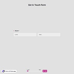
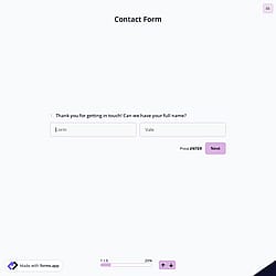
How to create a contact form for a website: step by step
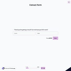
In this step, we will show the steps on forms.app since it takes seconds to create and use it on your website. Based on your own needs, you can choose an online form builder and follow the similar steps given below:
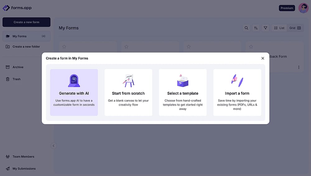
1. Choose a template or generate with AI
2. Add your contact form fields
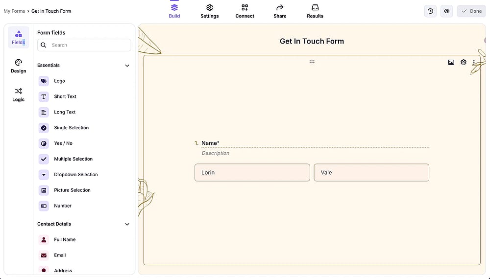
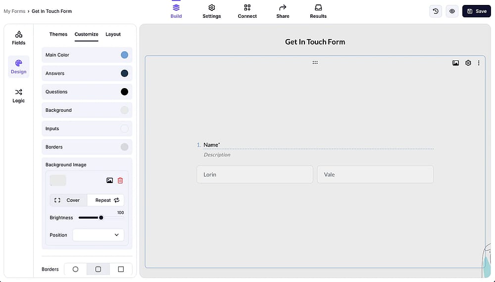
3. Change the design
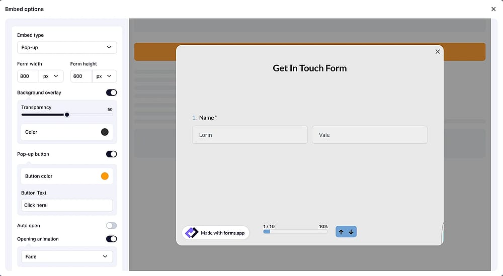
4. Embed it on your website
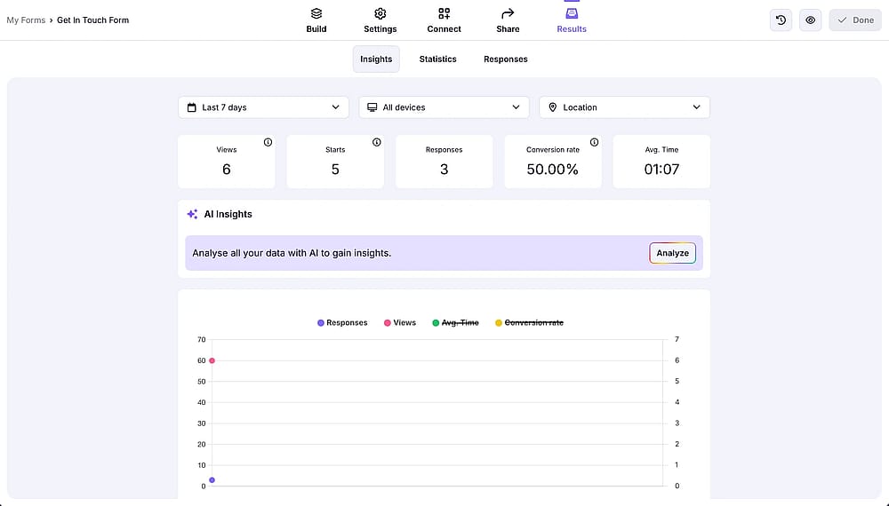
5. Analyze responses
Don't skip compliance and privacy
This part gets overlooked constantly, and it's worth a few extra minutes.
- Collect only what you need. Data minimization is a legal expectation in many regions, not just good UX.
- Add a short consent line near the submit button explaining what happens to the data.
- Know your obligations if you collect data from EU visitors. GDPR applies based on who's submitting, not where your business is registered.
- Decide a retention policy. Old submissions sitting in an inbox indefinitely are a liability, not an asset.
💡 From experience: Adding one line above the submit button: "We'll only use this to respond to your message" is a small change, but it consistently reduces the hesitation visitors show right before submitting, especially on forms asking for anything beyond name and email. I've watched completion rates tick up after adding nothing more than that sentence.
Contact form design best practices
Good contact form design is mostly about removing friction, not adding polish.
- Match your site's fonts, colors, and spacing. A form that looks bolted on signals "afterthought."
- Keep contrast high enough to read easily, and make sure the form works fully via keyboard.
- Use descriptive field labels, not placeholder text alone. Placeholders vanish the moment someone starts typing.
- Write error messages that explain what's wrong, not a generic "Invalid input."
Common mistakes to avoid
There are some pro tips to follow to make your contact form more effective:
- Too many required fields. If it isn't essential, make it optional or cut it.
- No confirmation after submission. Silence makes visitors assume the form is broken.
- Spam protection left disabled. Check this explicitly.
Wrapping up
A contact form doesn't need to be complicated to work well; it needs the right fields, a clear layout, and a system for actually responding to what comes in. If you're looking for a builder that handles the design and compliance details without extra setup, forms.app's contact form templates are a reasonable place to start. You can collect unlimited responses and invite unlimited team members to your team.
Frequently asked questions
No. Most builders, including forms.app, let you build and embed a form with a visual editor and a copy-paste embed code.
Name, email, and message cover most cases. Add more only if a specific workflow requires it.
CAPTCHA filters out the vast majority of bot traffic. This helps keep your inbox cleaner and your website interactions focused on real website visitors.
- August 2026 - Article revised and updated to align with 2026 standards
- Content updated from start to finish, including all steps and sections
- New headings added to improve the structure and coverage
- Visuals refreshed and updated
- Personal experiences added to provide more practical insights
- FAQ section added
Contributors
Researched & written by
forms.app, your free form builder
- Unlimited responses
- Unlimited questions
- Unlimited team members