Getting email signups and generating qualified leads is necessary to scale your business. That’s why most marketers focus on creating the most optimized landing pages.
Your form, however, is the last point of conversion. How you design your lead gen forms directly affects whether your prospects go down the buyers’ journey or not. A visitor can click on your ad, visit your landing page, and click the Sign Up button, but if they don’t fill out the form, you’ve lost the lead.
To generate more qualified leads, you need to fully optimize your lead generation forms—especially if there’s a huge difference between your page visitors and your conversions. In this piece, you’ll learn why it’s important to optimize your lead gen forms, some practical and advanced form optimization tips, and examples of well-optimized forms from real brands.
Why you should optimize your lead generation forms
You cannot build an email list or get anyone to sign up for your product/service without forms. But many people forget to optimize their forms for lead generation, believing that an optimized landing page is enough to score qualified leads.
Truth is, it’s not.
Every day, your competitors come up with some new tactic to get more customers. So to level the playing field, you’ll need to work harder to get your ideal customer to respond to your marketing campaigns and convert. And believe it or not, your form is part of your marketing campaign.
So when you have a plain-looking form that asks for your visitor’s personal information with no incentives, you’re not going to get the conversions you need to keep your business thriving. If you want to capture more leads and generate more revenue, you’ll need to create your form from the perspective of your visitors. Anything that might annoy them or dissuade them from filling it out shouldn’t be present.
How to optimize lead generation forms
Forms play a crucial role in capturing leads, especially after finding B2B leads. So, you need to know your audience and optimize your lead generation forms for them. However, some of the optimizations will be common. Here are some of them:
1 - Place your forms above the fold
“Above the fold” refers to the topmost area of your page that is visible without scrolling.
Eye tracking data collected by Nielson Norman showed that over 80% of people’s web viewing time is spent looking at information above the fold. In addition, not everyone who visits your webpage is going to scroll to the bottom. So if you want to maximize your conversions, place your forms above the fold of your page as it increases the chances of people seeing and engaging with them.
2 - Write compelling copy
There’s no way anyone will sign up on your form if you can’t convince them that your lead magnet is worth their time and attention. That’s why you should clearly state your value proposition on your forms. A value proposition refers to the benefits or value people will get when they buy your products or services.
A compelling value proposition not only emphasizes the importance of your product and what differentiates you from your competitors, but it also convinces people to fill out your form and move down the sales funnel.
3 - Use the right number of form fields
When it comes to creating lead gen forms, you have to be strategic with the number of form fields that you have.
If your form is overly long, visitors might feel that filling it out is not worth the effort. On the flip side, if your form fields are too few, many people might sign up but you won’t have enough information to know which leads are worth targeting and which aren’t. You have to find the right number of form fields that will allow you to get the most important information about your prospects without scaring them away.
To get this magic number, you’ll need to consider two things:
- The stage in your buyer journey. If you’re giving away a free checklist or guide, you’ll likely need your prospects’ first name, last name, and email address. But if you’re giving away something a bit more valuable, like an ebook, email course, or research report, you should ask for more detailed information so that you’ll know which future offers they’ll benefit from.
- The number of leads you generate. If your forms usually get a ton of signups, you should probably increase your form fields so that you can identify the leads to focus on. It’s true that more form fields will result in fewer conversions, but the people that do convert are usually more high-quality.
Sometimes, you might want to collect information about your prospects, but this data isn’t necessary for the conversion process. You don’t have to remove the form fields for them. Instead, use the required/optional format.
This means that important information like full name and email address are required. Required form fields usually have an asterisk next to the field name, and the prospect can’t sign up until they’ve filled the required form fields. On the other hand, the nice-to-have information like a home address and phone number can have the word “optional” next to the field name. So whether your prospects provide you with this information or not, it won’t stop them from signing up as long as they fill out the required form fields.
4 - Write a strong call-to-action
Your call-to-action, or CTA, is the final element that will determine whether or not your visitors fill out your form. A good CTA is attention-grabbing and convinces people to take the next step, trusting that you’ll deliver on your value proposition.
The key to writing a great call-to-action is clarity. You want to tell your visitors exactly what they’ll get once they sign up. You can’t do that if your CTA button vaguely says Submit or Learn more.
Instead of using boring CTAs like that, take your offer into consideration. Are you offering them a free email course? Or is it an ebook? A webinar, perhaps? Then think about the action you want your visitors to take and how that relates to the overall buyer’s journey you’ve mapped out. As you craft your CTA, ensure that it conveys this information in a way that is active, clear, and urgent.
So instead of frictive CTAs like Order and Buy, try these action-based ones:
- Get a demo
- Sign up for [OFFER]
- Gain access to the free [OFFER]
- Save your spot at [EVENT] now
- Download the [OFFER] for free
- Claim your discount now
- Yes, I want this [OFFER]
You can make your form headline a call-to-action and reinforce that message in your CTA button. This way, your visitors will be very clear about what they’re signing up for when filling out the form.
5 - Include your privacy policy
If you’re collecting Personally Identifiable Information (PII) such as names, emails, addresses, and credit card information, you’d do well to include a shortened version of your privacy policy in your lead generation form. There are two major reasons for this:
- The law requires it: The United States, Canada, Australia, and the European Union have laws that protect the privacy rights of their citizens.
- The California Online Privacy Protection Act of 2003 (CalOPPA) and the California Consumer Privacy Act (CCPA) protect the PII of the residents of California. The Personal Information Protection and Electronic Documents Act (PIPEDA) protects the PII of residents of CanadaThe Australia Privacy Act of 1988 protects the PII of residents of AustraliaThe General Data Protection Regulation (GDPR) protects the PII of residents of the European Union.
- It builds trust: Including your privacy policy on your lead gen form shows your visitors that you understand why they may be hesitant to give you their information and reassures them that their PII is safe with you. When a prospect sees that you won’t sell their information or send them spam, they’re more likely to trust you and fill out your form.
5 advanced lead generation form optimization tactics for better conversion
To improve your form conversion rates, you’ll need to go beyond the regular optimization tips listed above. In this section, you’ll learn some advanced tactics for form optimization to increase your conversion rates.
1 - Align your form with your buyer’s journey
Not all your visitors and customers are at the same stage of your buyer’s journey. There are prospects who have never heard about your product or service before but are interested to learn more about your offers. Some of them know a bit about your brand but are not sure if they’ll purchase anything from you yet. And others might already be repeat customers who are loyal to your brand and are excited to see what product or service you’ll offer yet.
Before creating your lead generation forms, identify exactly where your prospects are in your buyer’s journey. This way, you’ll be able to create a form that caters to their needs. For people who haven’t heard about your product or service yet, create a form that captures their attention and educates them about your brand. For prospects who are on the fence about becoming paying customers, make a form that collects data on their needs and preferences so that you can tailor your offers to their needs. And for those who are ready to buy, your form should collect their contact information and other specifics so that you can begin the sales process.
Knowing where each person falls in your purchase journey will ensure that you create forms that gather the necessary information about them without being obtrusive.
2 - Use lead form extensions
A lead form extension is a lead generation ad that allows you to collect information from prospects directly from the mobile search results page. You can create customizable lead form extensions in your Google Ads account and attach them to your desired campaign.
When anyone clicks on your ad that contains the lead form extension, they’ll be directed to the form where they can input their information instead of being directed to your landing page or company website. Once they fill out the form, the information will go straight to your business email address.
Lead form extensions are especially useful for businesses that run ads but don’t have a dedicated landing page. But they, however, don’t replace the need for a landing page for customers to visit. They just make it easier for businesses to generate leads through their ad campaigns.
3 - A/B test your forms and CTAs
Conducting A/B tests (or split tests) on your lead generation forms is the best way to find out which elements produce the highest conversion rates. You can run tests on elements like:
- Form headline
- Messaging
- Number of form fields
- Offers
- Visual elements (colors, layout, etc.)
- CTA copy
- Button colors
For each variable you test, create two or three versions (or variants) of it. Segment your audience into two or more groups—depending on the number of variants you created—and send each version to each group.
With CTAs, for instance, you can A/B test the CTA copy itself and/or the color of the button over a period of time. Once the test is complete, compare the results to see which version improved your conversion rate the most.
Pro tip: When running A/B tests, test one variable at a time with data from at least 100 visitors per test variation. This clearly shows you which versions drive the most leads. If you test multiple elements at a time, you might get confused as to which changes are yielding the best results.
4 - Use multi-page forms
In the last section, we talked about how you might need to use many form fields to find qualified leads. Since a very lengthy form might scare off potential leads, you can break up your form into multiple pages.
Instead of putting all your required fields on a single-page form, divide them into 2 - 5 pages. For example, on the first page, you can ask for the visitor’s name only. The next page could collect the person’s contact information. The third page could gather information about the person’s needs or business. And the final page will have the final form field and the CTA button.
By creating multiple pages, the visitor won’t be overwhelmed the amount of information you’re asking of them. And once they start filling out the form, they’ll likely fill it out to the end.
5 - Provide social proof
Dr. Robert Cialdini coined the term “social proof” in his book, Influence: The Science of Persuasion. Social proof is a phenomenon where people copy or follow the actions of others when they’re not sure what the right action to take is.
Think back to a time when you bought something just because your friend bought it and loved it. Chances are, you might not have heard about that product or store before, but you bought it anyway because you trust your friend’s recommendation. That recommendation is social proof, and it works well for driving qualified leads.
If you’re trying to get people to sign up for a product or course—especially if it’s paid—there’s nothing more compelling than showing them testimonials and reviews from other people who’ve benefitted from your offers. This is especially helpful if you’re targeting people who have never heard about your brand before or are on the fence about buying from you.
When these people see reviews from others who have used your product successfully, it reduces the hesitancy they may feel about how good your product/service is. You can even go beyond testimonials and use other forms of social proof like customer logos, awards, and third party certifications to showcase how much trust your customers have in your brand.
9 sign-up and lead generation form examples that convert
To show you how these optimization tips work in real life, we’ll share the best examples of lead generation forms from top brands and why they work.
1 - forms.app
forms.app Contact Us form is unique because it helps their customer support team quickly identify customers who are trying to solve a problem and those that want to report abuse.
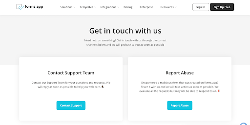
Both the Contact our Support Team and the Report Abuse form are punchy, straight to the point, and only collect information that is necessary for the support team to help the customer. The Report Abuse form, however, has fewer form fields as it asks only for the URL of the violation form and any comments the user might have about the situation they’re struggling with.
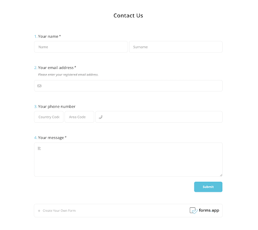
The most striking thing about these forms, though, is that the web pages on which the forms are hosted are bells and whistles that may distract the customer when they’re filling out the form. Since there are no navigation points that can draw the user’s attention away from the situation they’re about to report, they’ll be able to explain their problems accurately and get the right support.
At the bottom of the forms, forms.app generates leads by asking users to create their own forms with the tool.
2 - Jasper.ai
Jasper.ai is an AI content creation tool with a full suite of features including art generation, chatbot and plagiarism checker. Their signup form has the most necessary fields for a typical signup process: first name, last name, and email address. Any other information Jasper will need from a user will be collected later on as the customer gets more familiar with the app and how it works.
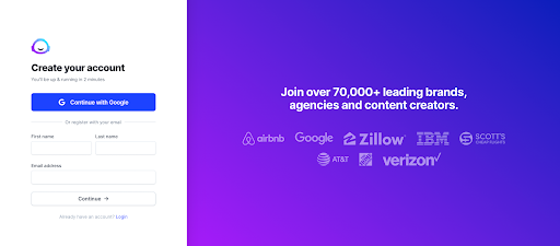
At the top of the form, Jasper gives people the option to sign up with their email. But they also make it clear that whether they sign up with their email or they use the form fields, the entire sign-up process won’t take more than two minutes.
Right beside the form, Jasper uses data (70,000+ leading brands, agencies, and content creators) and customer logos to reinforce just how many high-profile businesses trust the tool to meet their needs.
3 - Affinity
Affinity’s form to request a demo is placed above the fold where visitors can easily see it.
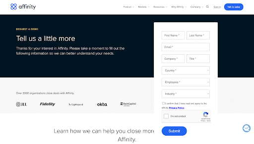
In the form copy, Affinity makes it clear that the purpose of the form is to collect data about the prospect so they can best understand their needs. Affinity asks for the first name, last name, email address, company, title, employees, and industry of the prospect. This information will help them figure out the features of Affinity that the prospect might be interested in so that they can capitalize on that during the demo.
The landing page itself features social proof in the form of customer logos, data/numbers, and testimonials from existing customers.
So if a prospect is hesitant to request a demo with Affinity, these social proof elements are there to convince them that requesting a demo of Affinity’s product is worth their time.
4 - HubSpot
HubSpot CMS includes a “Get a Demo” form, which is a bit shorter and more straight-to-the-point than Affinity’s.
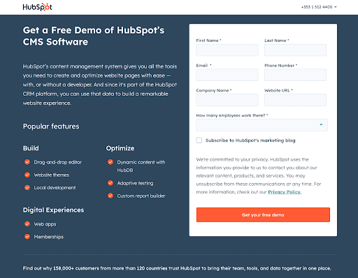
On the left side of the page, the form copy briefly explores the popular features of HubSpot CMS. This helps the prospect put things into perspective and decide if HubSpot CMS offers features that they truly need in their work operations.
The form itself asks for the prospect’s first name, last name, phone number, company name, website URL, and the number of employees that work there. This information helps HubSpot decide if the lead is worth pursuing.
The form also gives the prospect an option to subscribe to HubSpot’s marketing blog. This is optional, though, and they can request a demo without choosing to subscribe.
Before the CTA button, HubSpot clearly states that they value their prospects’ privacy. They also briefly break down what they’ll use the information for, and added a link to their full privacy policy.
5 - Omniscient Digital
Omniscient Digital has a Contact Us form that aims to collect important information about businesses that want to hire them for content marketing purposes.

While the form is a bit lengthy, it does do a great job at helping Omniscient narrow down which leads they should set up meetings with.
The forms ask prospects to provide details about what they need help with, tools they have set up, annual revenue, and monthly marketing budget. This information helps the team at Omniscient Digital know if what a prospect needs is in their wheelhouse and if the budget is something they’d be able to work with.
Notice how the required fields are marked with a red asterisk and the optional form field is marked optional. At the bottom of the form, the agency notes that they “don’t send spam and we love GDPR”. This shows their prospects that their information is safe and will not be sold or used for shady operations.
Just like Affinity, the page the form is on also features logos of companies that Omniscient Digital have helped and video testimonials from their current clients.
6 - Planable
Just like Jasper.ai, signing up for Planable is simple. There are form fields for the name, work email address, and password. There are also options for users to sign up with Facebook and Google.
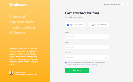
On the left of the page, Planable includes its unique selling point (USP), which states that Planable can help people plan and approve social media content six times faster than normal. They reinforce this claim with testimonials from existing customers about how Planable helped them save time and streamline their workflows.
7 - Uber
Since Uber is a two-sided marketplace that caters to both drivers and passengers, they need to collect data on their two buyer personas. There’s also a new audience that Uber caters to -- people who order delivery via Uber Eats. To get the right data from leads, Uber asks users what they want from the app right from the start.
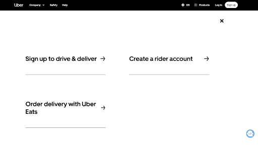
This direct approach instantly segments Uber’s prospects and allows them to deliver unique forms to each lead group. If you’re a brand that serves two different audiences of the same service, use your forms to segment your lead types from the jump.
8 - Wealthfront
Much like forms.app and Uber’s forms, Wealthfront’s sign-up form helps the company segment its leads into two groups:
1 - People who want to earn interest on their savings
2 - Those who want to automate the growth of their investment portfolio
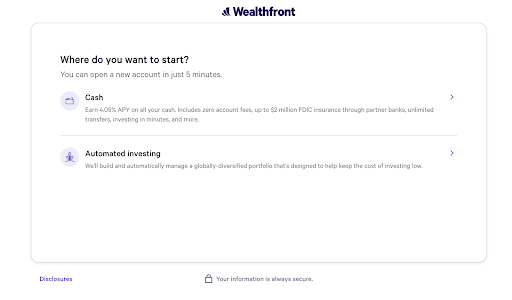
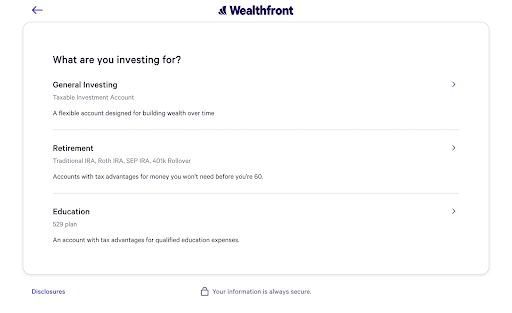
Wealthfront’s form is a multi-page form, so users move to the next page depending on the option they picked on the first page. Those who want to earn interest on their savings will specify who owns the account. And those who want automated investing will choose whether they want a general investment account, a retirement account, or an education account.
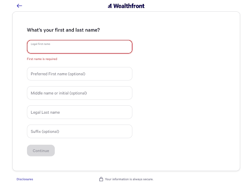
Then Wealthfront asks for personal information like legal first name and last name, middle name, and preferred first name and last name. Then the user will enter their email address and password.
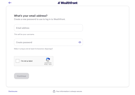
Finally, Wealthfront asks for a U.S. mobile number with which to verify the user’s authenticity.
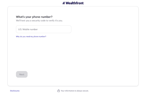
At the bottom of the form, Wealthfront assures prospects that their information is always secure.
If all these form fields were placed on a single page, it would have been overwhelming for prospects. But because it’s broken up and tailored to their needs, they’ll feel more at ease while filling out the form.
9 - Peloton
Peloton’s sign-up form is pretty straightforward, as it only requires the user’s email address. But the star of this form is actually the form copy and visuals.
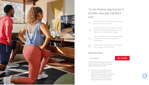
The form headline itself, Try the Peloton App free for 2 months is a call to action. Underneath it, Peloton succinctly reminds users of the benefits they’ll receive if they sign up. The image beside the form copy helps the user visualize just how easy and convenient it is to use Peloton to work out and get (or stay) fit.
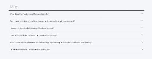
Below the form, Peloton answers Frequently Asked Questions that prospects might have. This gives them more understanding of what they’re signing up for.
Start generating more leads today
If you want your prospects to sign up for your product or service, you will do well to optimize your lead generation forms to create a frictionless user experience and manage leads better. Making the process smooth and reinforcing the value of your product eliminates any hesitancy a prospect might feel when they see your form. This increases the chances of people signing up and becoming qualified leads.
While there isn’t a one-size-fits-all tip to optimizing your lead gen forms, the tips outlined above are a great starting point if you’re looking to improve your form conversion rates. The bottom line, however, is to try different things to see what works for you. Experiment with your offers, form fields, product messaging, and CTAs, and note the methods that work best for your business.
