Surveys are designed to obtain information and opinions from respondents by asking questions about a topic. Surveyors care about the participants' views and follow a path according to survey results.
Even if you manage to receive a high number of replies, a survey is not over. Simply put, responses are the data you collect. The survey report is a way to present and interpret this data, apply the findings to your study, and turn them into knowledge.
This article will explain the definition of a survey report, best practices to follow when creating a survey report, how to create graphics for a survey report and examples with all details.
What is a survey report?
You can find out if your customers like your product or services, whether your customers get good service from the support team, or how you can improve the service and your product by conducting a survey.
A survey report is a document that objectively, precisely, and factually presents all the pertinent facts about the survey. The survey report summarizes the replies and objectively presents the survey results.
It is essential to prepare a survey report when you complete survey research. Most reports include graphs and charts to present the findings in a visually pleasing manner. The report should be simple to read and understand. A survey report usually contains the following:
- Completion rate
- Total number of responses
- Survey views
- The date range of responses
- Distribution of survey respondents' responses
- Closed-ended question analysis
- The thoughts and interpretations of the researcher/survey owner
Best practices to follow when creating a survey report
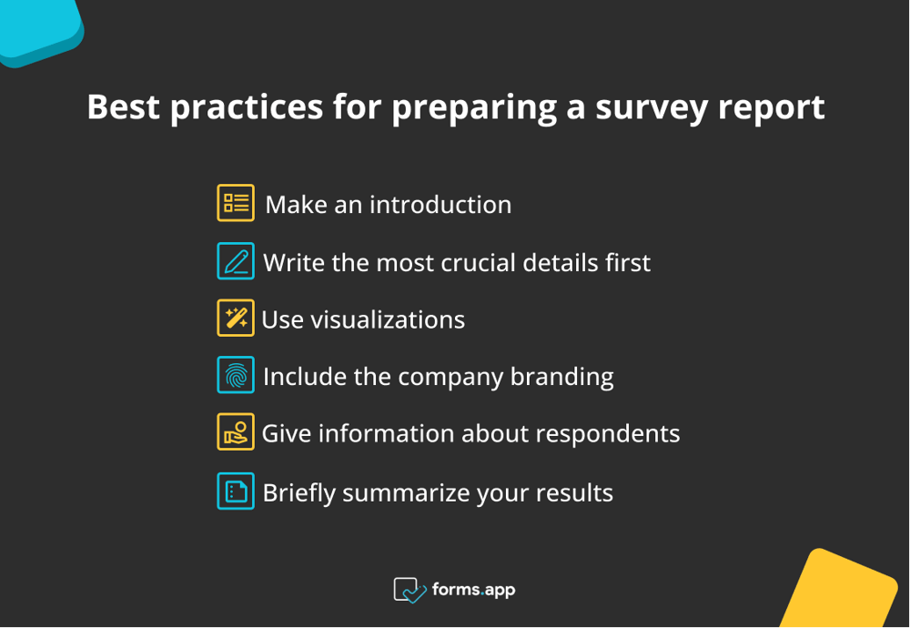
The survey report aims to accurately and comprehensively communicate the information gathered during the survey. Here are the guidelines to remember while building a survey report:
- Make an introduction: At the start of the report, specify what the main aim of this survey was when you were starting off. Explaining the survey's purpose will help establish the mood. Give the facts you are delivering context.
- Write the most crucial details first: You need to grab the attention of your audience and readers to make your point. Emphasize crucial points at the beginning and make sure the report is logically arranged with distinct headings and subheadings.
- Use visualizations: A survey report can be effectively presented using graphs and images. Use a variety of visualizations, such as bar graphs, pie charts, and other formats, to keep it interesting.
- Include the company branding: Incorporate your brand as much as possible within the survey report. Make sure to add your company’s details in a footer or at the top of the page, along with your logo. You can customize your report with colors suitable for your brand principles.
- Give information about respondents: Providing information about the respondents in the survey report makes it more reliable and effective. In your survey report, you can include information about the age, education level, and gender of the participants.
- Briefly summarize your results: Give the reader an overview of the data points at the conclusion of the survey report. Provide a succinct and straightforward description of the survey's results.
Best practices for preparing a survey report
How to create graphics for your survey report
The survey reports are a crucial study component; thus, you must continually offer correct data. Making a survey report is one thing, but making a good survey report is quite another. Therefore, we have shared how to create graphics for your survey report.
forms.app’s statistics page
You can generate an effective survey report through online survey tools. forms.app is one of the best survey maker tool. You can get the survey reports you created on forms.app easily from the statistics page. Here is how to create the graphics for your survey report on forms.app.
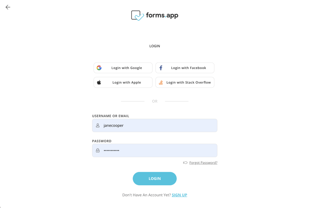
1 - Sign in or create a forms.app account: You can get the report graph of your survey that you created with just a few clicks, without writing code on forms.app. First, you can log into your existing account. If you do not have an account, you can create an account in seconds and become a free member.
Sign in or create a forms.app account
2 - Choose ready-to-use templates or begin to form from scratch: You can choose templates for many topics on forms.app. You can easily design your survey by selecting ready-to-use survey templates. Additionally, you have the option of starting from scratch with your survey.
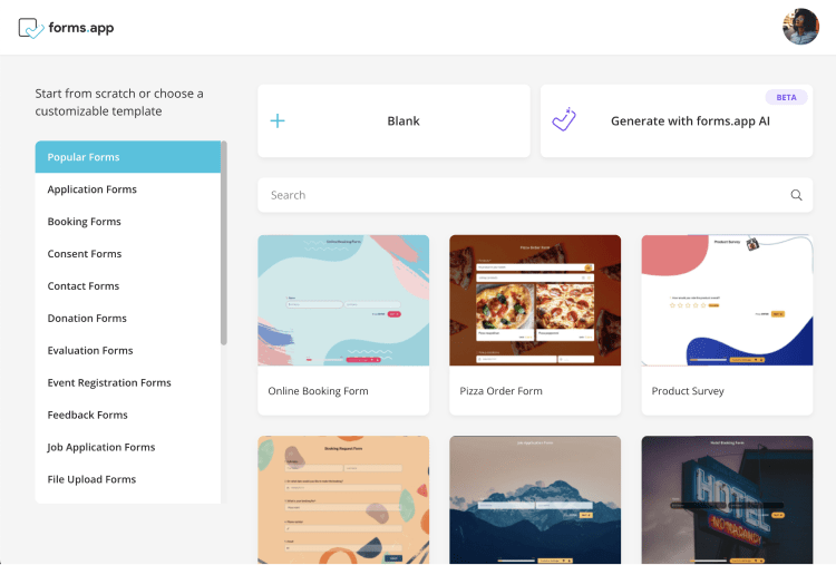
Choose ready-to-use templates or begin to form from scratch
3 - Edit the questions and customize the survey design: You can edit the pre-made questions according to your needs. The questions can be changed, added, or removed. In addition, forms.app gives its customers access to hundreds of colorful themes. You can select one of the ready-made themes for your survey.
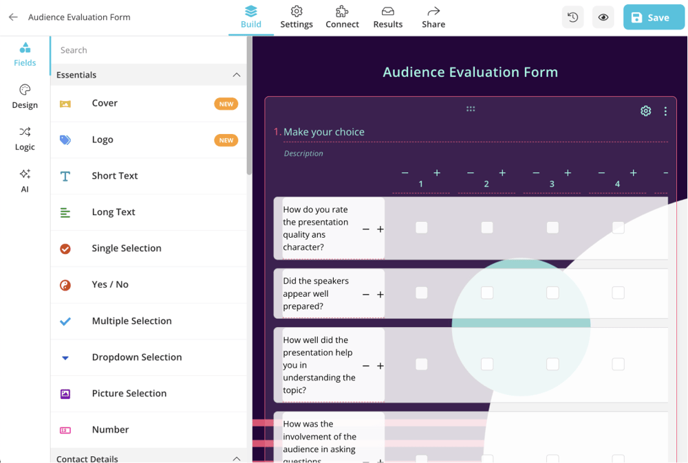
Edit the questions and customize the survey design
4 - Adjust the settings and share your survey: After you finish your survey settings, you can save and share it with respondents. You can send a link to participants or embed your survey on your website.
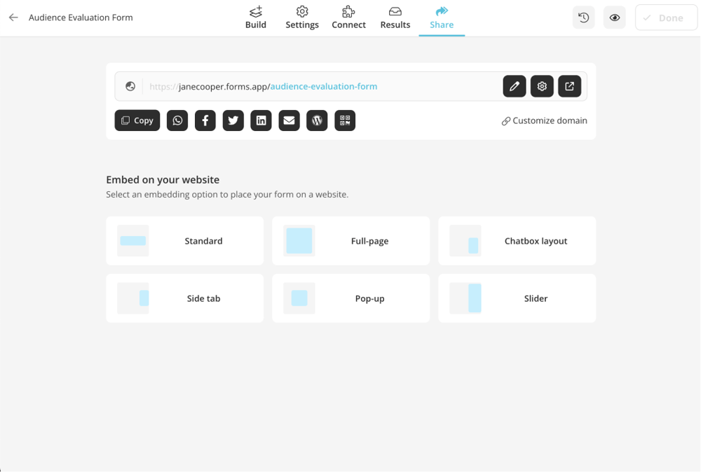
Adjust the settings and share your survey
5 - Get a survey report graphic: After sharing your easily prepared survey on forms.app with the participants, you can quickly see the answers. After the survey process is over, click on the "results" button above. You can see the statistics and respondents in the “results” section. Thus, you can reach the report graph of the survey you prepared on forms.app.
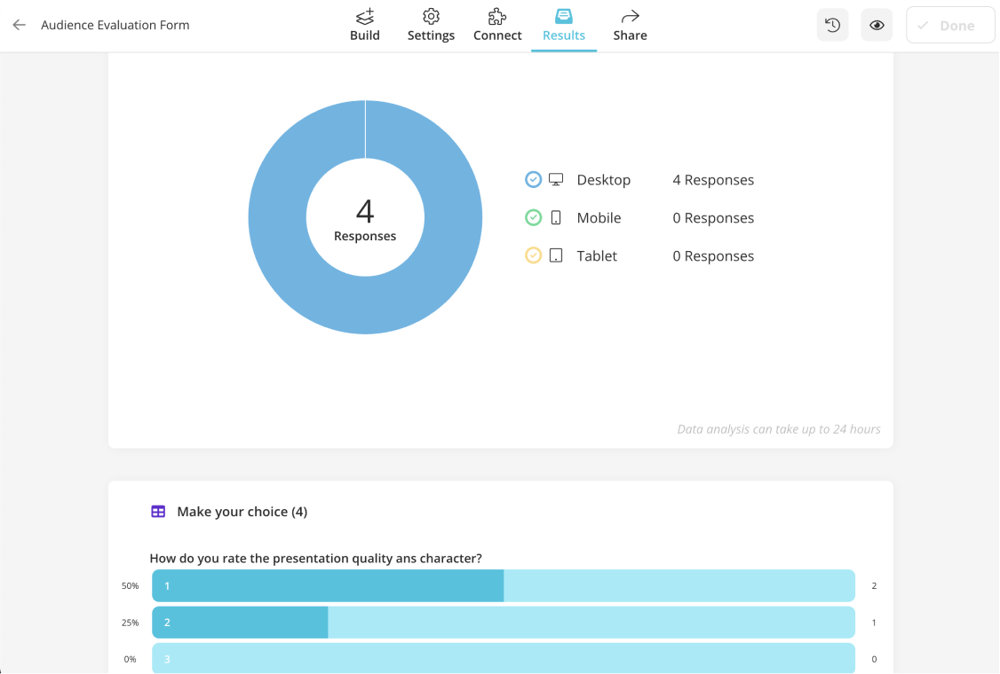
Get a survey report graphic
MS Excel or Google Sheets
You can easily create a graph of your survey report on MS Excel or Google Sheets. Here we shared the steps you need to follow.
1 - Open Excel or Google Sheets and create a new spreadsheet. Or simply download your survey data from forms.app.
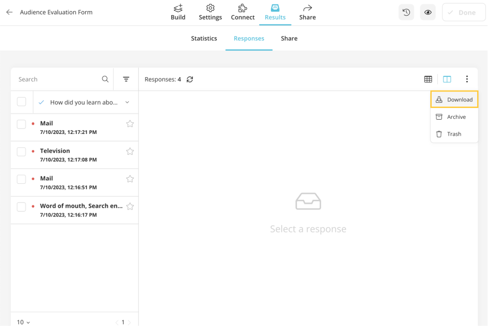
Open your data on a spreadsheet
2 - Make sure your questions and answers are in different columns.
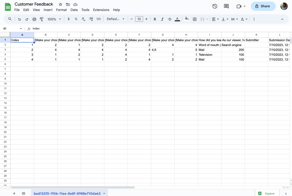
Have your questions and answers in separate columns
3 - Move your mouse over the cells that hold the answer data and choose them.
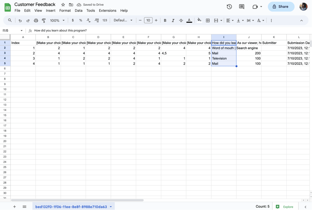
Choose related data
4 - Select the "Column Chart" or "Bar Chart" option from the list of chart types under the "Insert" menu.
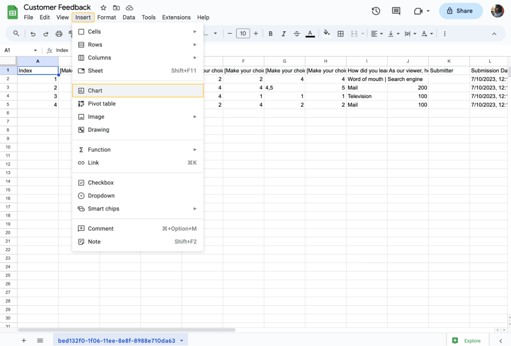
Insert a chart
5 - Customize the chart according to your needs.
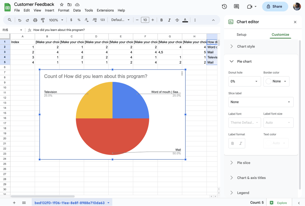
Customize your chart
6 - Save the chart and use it in your report.
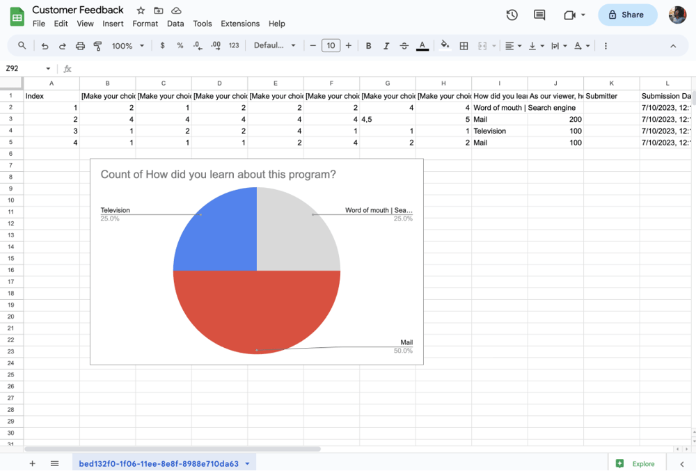
Use it in your survey report
Custom data visualization tools
Data visualization displays data visually, such as graphs and charts. This makes it easier for individuals to draw conclusions from data and make data-driven decisions. You can create your survey report graph using custom data visualization tools like Tableau, Klipfolio, and Qlik Sense.
The list of data visualization tools
A survey report example
The essential data should be presented in your survey report clearly and understandably so you can reach conclusions fast. Let’s imagine the survey research conducted by a perfume company was conducted from March 7 to March 16 via an online survey, which consisted of 16 questions.
A total of 150 customers participated in the survey. The survey aimed to measure product quality, customer service, and overall customer satisfaction level. Of the 150 customers surveyed, 55% rated the overall survey score as excellent, 36% as good, and only 9% as average or below. You can review the following item created on forms.app.
- Completion rate: The completion rate is calculated by dividing the total number of questions in your survey by the number of questions that were answered. If your survey has 16 questions and respondents answered only 8, the completion rate is 50%.
- Total number of responses: The total number of responses is the total number of respondents you selected to participate in the survey. In our example, the total number of responses is 150.
- Survey views: The total number of views versus the number of different people who viewed the survey, as some people may have viewed the survey more than once.
- The date range of responses: You must provide the date range of the responses in your survey report. In the above example, the response date range is between March 7 and 16.
- Distribution of survey respondents' responses: Survey respondents have different opinions about your products and services. In our example, 55% rated the overall survey score as excellent, 36% as good, and 9% as average or below.
- Closed-ended question analysis: Closed-ended questions are analyzed more quickly in the survey report. The analysis process is complex in open-ended questions as the participants express their opinions directly. You can easily illustrate closed-ended questions with pie charts or bar charts.
- The thoughts and interpretations of the researcher/survey owner: The researcher's thoughts and comments should be included in the survey report. This reflects the survey owner’s insights.
Key points to take away
In conclusion, a survey report aims to impartially convey the data acquired during the survey. It does it in an easy-to-understand and aesthetically pleasing way by survey summary of all the replies gathered.
The report has a typical structure, with sections, headers, subheadings, and more. Usually, it is produced at the conclusion of a survey. To create an effective survey report, you should:
- Have a clean structure
- Use simple language
- And focus on the key results
Ensure the survey report is accurate and professional, giving only pertinent information. This article has explained the definition of the survey report, the statistical significance of the survey analysis report, and how to create excellent graphics for your survey report.
Contributors
forms.app, your free form builder
- Unlimited views
- Unlimited questions
- Unlimited notifications
