Web surveys are a crucial component to consider when building your ecommerce store. They facilitate all sorts of actions that play a significant role in lead generation. Whether this is completing a questionnaire or leaving product feedback, a well-performing e-commerce website does not exist without at least a few web surveys.
The question is, how do you ensure that a visitor interacts with your survey design? To answer this, let’s explore eight creative web survey examples that you can sink your teeth into and take inspiration from. From email-based forms to interactive in-app surveys, there’s plenty to take note of when it comes to building your web survey campaign.
What is a web survey?
Web surveys collect data and customer insights on behalf of businesses. They’re typically distributed to customers via email or on-site widgets so that they can respond in a convenient manner.
95% of businesses collect customer feedback in some form and one good way to collect customer insights from your online store is to introduce a web survey to your store design. Web surveys are a method of data collection that comes in the form of questionnaires, feedback forms, and site surveys that any customer can respond to on the World Wide Web.
Whether you embed your web surveys on your online store or send them via email or SMS, each time you receive responses from your customer base, you collect more data on your brand, products, and services that are stored in a web-based database.
For example, a retail giant like H&M may conduct a web survey to study the purchasing habits of their target consumers. As they gather data on purchase preferences, they gain greater insight into the styles of clothing their targets are most interested in and can adapt their marketing strategy accordingly.
In an era when 90% of businesses use online surveys to influence their product manufacturing, collecting customer insights undoubtedly contributes to online store success. With more customer data under their belts, brands are better prepared to create products and services personalized to demographic trends and preferences.
The benefits of adding online surveys to your e-commerce store
So what are the benefits of adding online surveys while building your online store? From learning more about market trends to identifying issues with your products and services, there’s a lot you can take from web survey insights.
Here are some of the ways adding a web survey to your online store strategy could benefit you as an e-commerce seller:
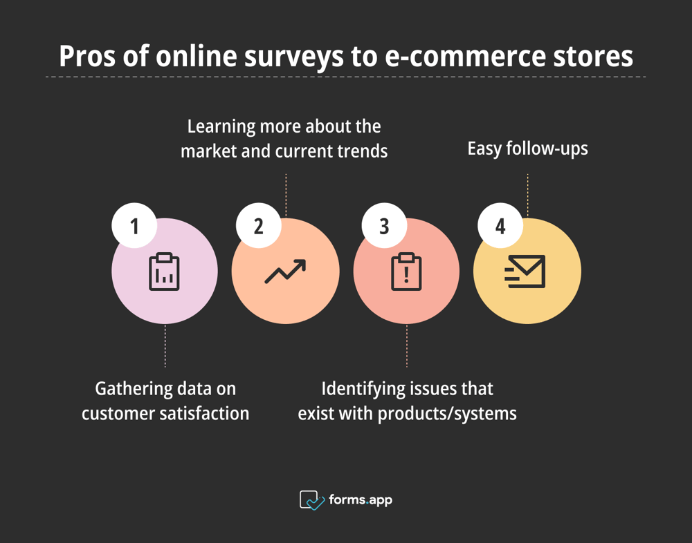
Advantages of online surveys in e-commerce stores
Gathering data on customer satisfaction
Did you know that 86% of buyers are willing to pay more for a great customer experience? Using a web survey to ask questions about customer satisfaction enables you to learn about what makes your target customers happy when shopping online. With this feedback in mind, you can create targeted strategies that prioritize customer satisfaction and win your brand more conversions.
Learning more about the market and current trends
If your brand falls behind on demographic trends, it is likely to become irrelevant to your target market. Asking your target leads questions about their trending favorite products and the types of brands they are currently loving helps you gain greater insight into how the market is moving. Staying updated with emerging design trends allows brands to align their aesthetics with customer expectations. Incorporating these trends into your brand identity can strengthen your market positioning and create a lasting impression.
Identifying issues that exist with products/systems
Web surveys are most commonly used to gather feedback on customer service, product purchases, and a customer’s overall experience with your brand. Here, you can learn more about negative experiences and any faults with products or systems that may affect the success of your online brand.
Not only does this give you the chance to respond to the consumers who have had a negative time shopping with you, but you can take this feedback onboard and adapt your online store accordingly, which will eventually increase your profitability.
Easy follow-ups
The average survey response rate is between 5% and 30%, which is quite low. However, if you send a web survey to your customers via email or SMS, it’s easy to follow up with those who may have scrolled past your message. The key here is to include an incentive, such as a discount code or giveaway draw, for those who complete the web form.
Essentially, a web survey allows you to get closer to your customers. As you gain greater insight into their preferences, trends, and favorite competitors on the market, you unlock a better chance of creating a product that becomes ‘hot’ amongst your demographic.
How to create a web survey online using forms.app
In 2024, it’s never been easier to create a web survey for your online store. Whether you leverage a ready-made form template, invest in a form builder, or opt for a WordPress integration, web surveys are easy to master, even for form-building beginners.
After building your e-commerce website, creating your web survey will only take a few simple steps. If you’re a form-building beginner, our free form-building tool offers a guided form-creation experience that enables you to create a detailed web survey from scratch.
You can customize each step of your form-building journey, and you can enjoy our easy-to-use survey maker interface, which allows you to drag and drop questions onto your form with ease. Better still, you can even personalize all elements of your web survey, from colors to fonts, for a form that blends in seamlessly with your branding.
What does a successful web survey look like?
Web surveys must be engaging and stand out to the consumer while still blending in seamlessly with company branding. While there is no magic recipe for a perfect web form, here are some elements to consider when crafting the best survey for your online store:
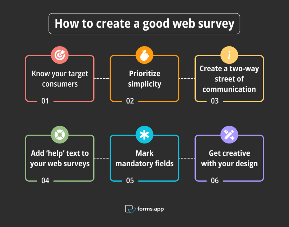
Tips for a well-designed web survey
- Know your target consumers: Factors like the age, gender, and location of your target audience and the device they tap in from can impact your web survey design. Think about your survey design and what UX elements may attract leads. This could be as simple as adding entertaining graphics or choosing an incentive that sparks engagement.
- Prioritize simplicity: It’s crucial that you keep your survey as straightforward as possible in order to attract attention from consumers of all attention spans and abilities. Simplified structures don’t overwhelm consumers, meaning that they will be more likely to engage with your web survey.
- Create a two-way street of communication: It’s important not to just use your survey to promote a product or advertise a newsletter. If a consumer is taking the time to input their information, let them know that their answer is valued. One way to do this is to add an end screen on completion that not only thanks a visitor for their information but also tells them more about the next steps.
- Add ‘help’ text to your web surveys: Not all consumers share the same abilities, and some often require more assistance when engaging with online content. If something on your form appears complicated or confusing, add an optional help text pop-up that could explain more about a certain field or section of the survey.
- Mark mandatory fields: Not all users want to fill out every question within a survey, especially if the form is multi-step. One way to combat this is to highlight mandatory and optional fields, arming the user with more choices when inputting their information. If a consumer has control over the information they choose to share, they are more likely to complete the form.
- Get creative with your design: Think about how many subscriptions, feedback, and contact forms you've seen on the web. It’s no wonder that the process of filling another one in can often turn visitors away. In order to combat this, get creative with your survey design. If you can provide a new experience or personalize a user’s journey, you’ll see your web survey engagement rise.
Building your own creative survey: 8 Brands to take inspiration from
Now we know what makes a good web survey, let’s have a closer look at some of the brands smashing their web survey design in 2024.
1. Website survey: Calvin Klein
First up, let’s take a look at this customer satisfaction web survey from Calvin Klein.
With a minimalistic design that combines text-based responses with interactive imagery, this example shows how you can use icons to provide answers as well as longer-form text boxes for more actionable insights.
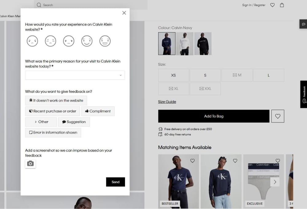
Image Source: Screenshot: Calvin Klein
A few other features we love are the ability to choose what area of the customer experience you want to give feedback on and the opportunity to upload a screenshot to help tell a better story about your point.
2. In-app survey: Vodafone Ziggo
Next up, we have the in-app survey from Vodafone Ziggo. This web survey was made to gather insights for research on an upcoming feature.
During the product development stage, leveraging a web survey for data on customer preferences is a great way to ensure that you create a popular final product that drives conversions.
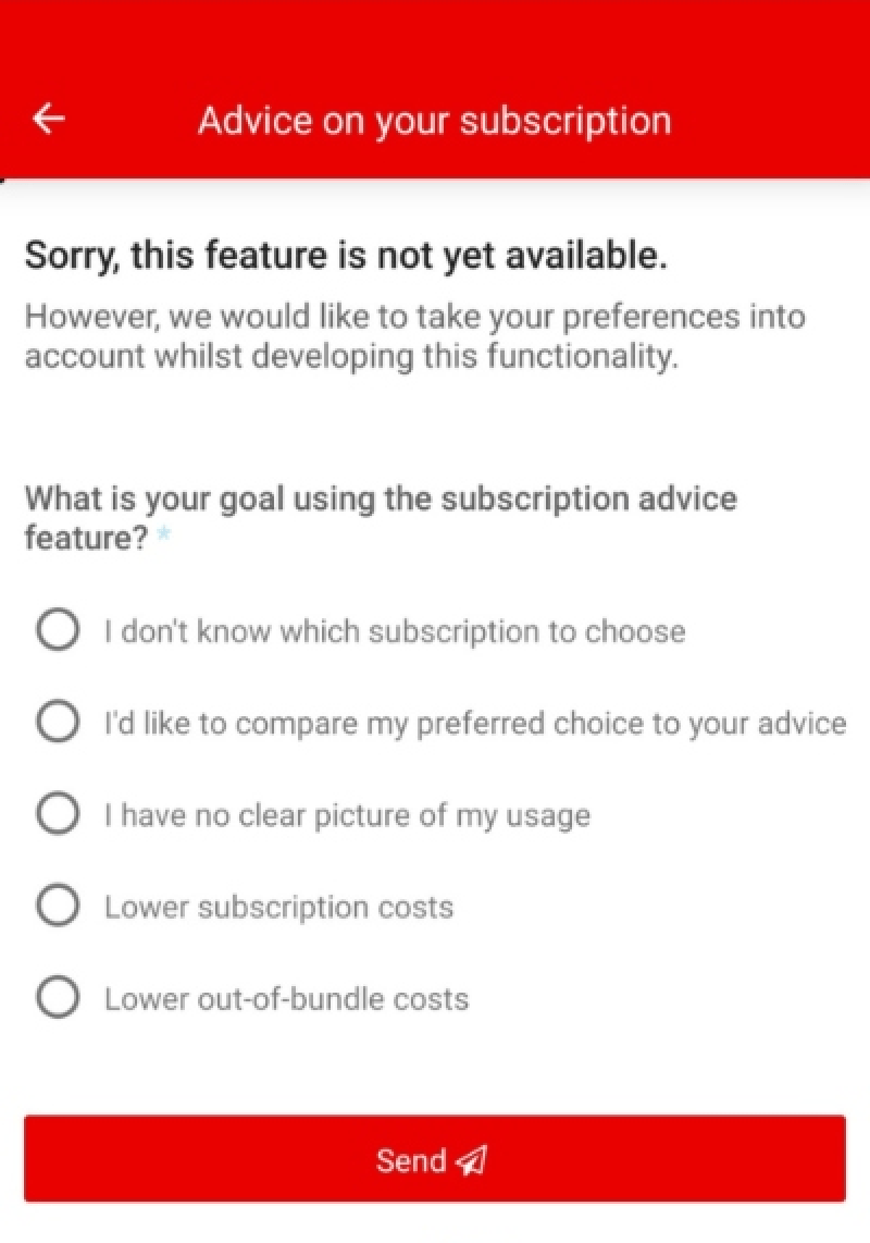
Image Source: Screenshot: Vodafone
Vodafone did just this with their in-app survey, which asked customers what they would like to see from a subscription advice feature. Here, they quizzed customers on what they would want from a subscription advice tool and used that information to create a targeted service for their loyal users.
3. Thinx’s feedback survey pop-up
Thinkx’s web survey is a pop-up, which is a great way to capture consumer information on the go.
Taking an approach to web survey design that was short and sweet, they simply ask their users one question: ‘Where did you hear about Thinx’?
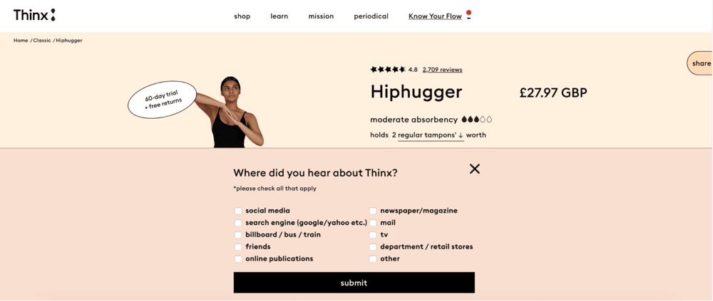
Image Source: Screenshot: Thinx
With a checkbox feature and a bold call to action button, this web form is quick and easy to fill in, which will encourage more users to interact.
4. Electric Eye: feedback survey
Next, let’s talk about Electric Eye. Their exit-intent survey follows the same design as Thinx with a pop-up feedback form. However, this is used to cleverly determine the barriers to users not scheduling a call with the company.
With a text-based response feature, users can be as specific or as vague as they like, placing the user in control of the web survey and how they would like to contribute.
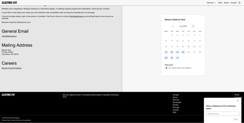
Image Source: Screenshot: Electric Eye
However, what we love most about Electric Eye’s survey design is the two-step web form choice. While we only see one question pop up in the right-hand corner of the screen, users who interact and click next are then asked a few more in-depth questions before they leave the site.
This encourages more customers to interact, as they are not overwhelmed with questions when they first see the survey.
5. Email survey: DHL
DHL is a great example of a CSAT web survey. It is full of easy-to-answer questions and uses a checkbox format to improve accessibility. Our favorite thing about this survey is how DHL improved its response rate by adding the survey directly to a user’s delivery notification email.
In this case, the email is more likely to be opened, and with the delivery of a product fresh on the mind of the consumer, they are more likely to fill out a positive response to the form.
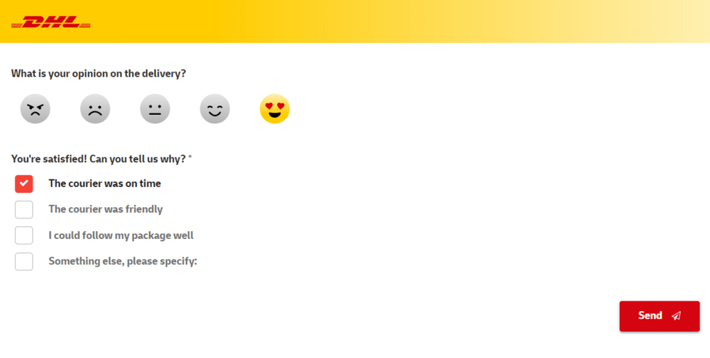
Image Source: Screenshot: DHL
6. FoodCorps market research survey
Foodcorps allows their customers to take the reigns when completing their market research survey.
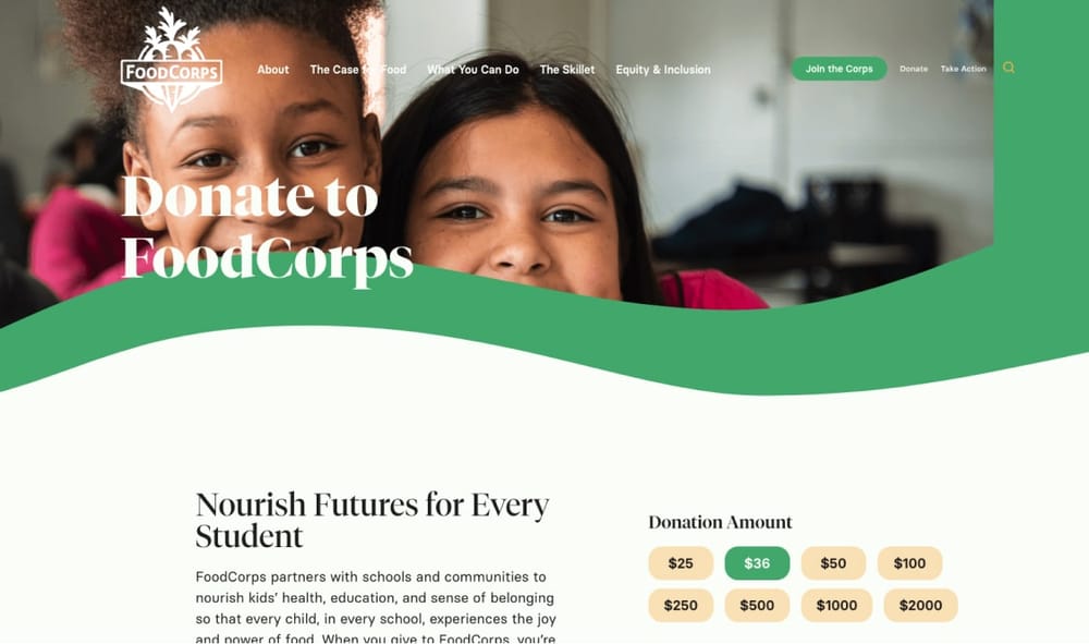
Image Source: Screenshot: FoodCorps
Designing their survey around one open ended question, their web form allows for a variety of answer choices.
By asking why their visitors came to FoodCorps today, they provide space for users to talk about their own struggles, ideas for change, and needs and motivations.
Better still, in the same way as the Electric Eye survey, they also sneak in a two-step survey when they have hooked visitors, asking them to rate how easy it was to accomplish the task they set out to do on-site while their first response is fresh in their minds.
7. Website survey: TomTom
Next, we have TomTom. This web survey is a great example of how an online form can address two topics simultaneously in the same feedback session.
First, the brand asks for general feedback on their site experience before moving straight into an NPS survey while respondents are engaged.
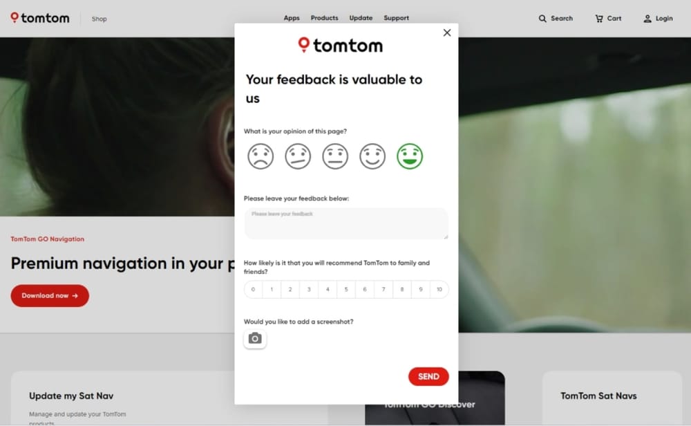
Image Source: Screenshot: TomTom
This allows TomTom to gather two sets of data at once, using only one web form. This saves the respondent time and effort and provides the brand with two data sets of different topics to map trends between for future development.
8. Email survey: Beerwulf
Last but not least, let’s look at this email survey from Beerwulf. This is a great example of how you can combine your marketing efforts with your web surveys for a more creative approach to gathering customer feedback.
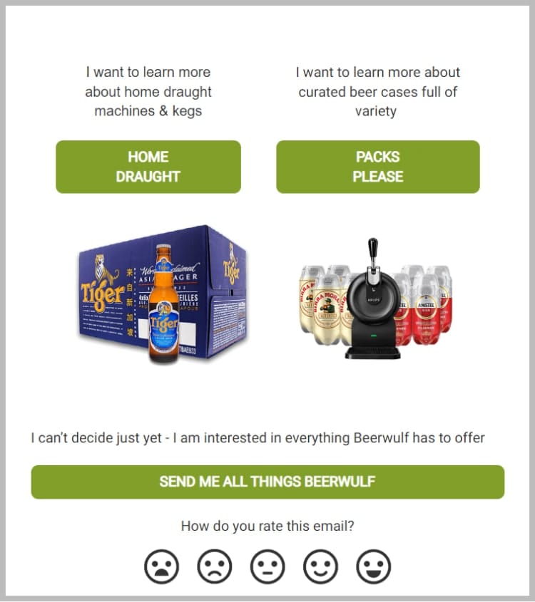
Image Source: Screenshot: Beerwulf
Here, customers can choose between different product categories they would like to learn more about before being met with a feedback question at the bottom of the email.
With an icon-based response feature, this is easy to complete alongside selecting your marketing promotion preferences, making for a great survey/marketing combo form. Using product images, call-to-action buttons, and an accessible format, you can’t go wrong.
Time to get creating
For an ecommerce business, customer feedback is everything. The more insights you gather, the closer to the consumer you’ll be.
Finding new ways to inject creativity into your web survey design is the key to boosting engagement and encouraging form interaction.
In fact, the effort you put into your survey design is directly reflected in the amount of data it generates for your business.
Contributors
forms.app, your free form builder
- Unlimited views
- Unlimited questions
- Unlimited notifications
