How to make line graphs in Google Sheets (Easy steps)
Google Sheets is an excellent data-saving tool for businesses, companies, organizations, or schools. When you put Google Sheets and line graphs together, they create perfect work. Line graphs are handy if you want to sum up your data.
You should never underestimate the practical usage of Google Sheets. As long as you know how to use Google Sheets effectively, you can boost your success. In our article, we have gathered the basic steps to show you how to create a line chart in Google Sheets. Also, you can find frequently asked questions about the topic to understand better!
What is a line graph in Google Sheets?
Google Sheets line chart or line graph is a vertical axis or horizontal axis that visualizes the changes in the data sets. Line graphs include various sets of data to show the difference between the data or prove the change throughout time or variables.
Types of line graphs
There are 3 types of graphs to illustrate the data. Each of them might have a different strong side to choose from. Therefore, based on your data, the type of line matters, and you need to choose the right one according to your data. So, have a look at the line graph types:
- Simple line graph: Used for plotting a single line to show the relationship between two variables.
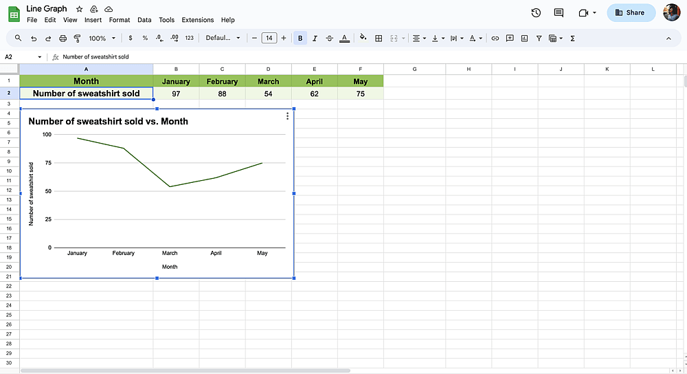
Simple line graph
- Multiple line graph: Used for plotting two or multiple lines to illustrate how the dependent variables differ over the same period of time.
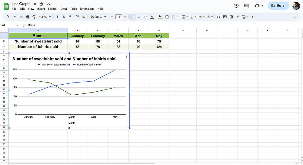
Multiple line graph
- Compound line graph: Used for plotting multiple variables similar to a multiple line graph.
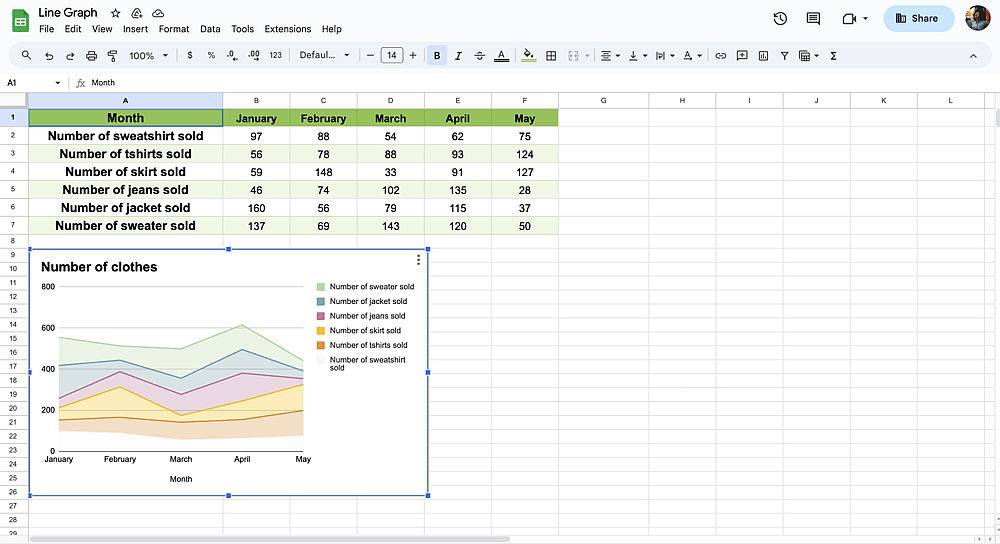
Compound line graph
Why use line graphs in Google Sheets?
As it is obvious from the definition of the term, line graphs are the perfect tool to visualize your data. With its user-friendly and easy-to-understand features, line graphs have many advantages for you. If you are curious about why you should use line graphs in Google Sheets, here are some essential reasons:
- Helpful in displaying changes and patterns
- Beneficial for displaying even minor alterations that are harder to grasp in other graphs
- Help you find the missing data faster
- Easier to understand
- Enable you to see the connection between the related data
- Efficient tool to show the whole data
For all these reasons, you should realize the power of the line graphs. If you are convinced enough, look at how to make a line graph online in Google Sheets.
How to create line graphs in Google Sheets
As long as you follow some definite and easy steps, it is easy to create line graphs in Google Sheets. If you want to empower your Google Sheet with a well-organized insert chart, you need to follow the instructions given below step by step:
1. Open Google Sheets
Google Sheets dashboard
In the first step, you need to sign in to your existing Google account, or if you do not have any, you can create one and continue. Then, open Google Sheets to view the specific sheet you want to transform into a smooth line chart.
💡 If you are using forms.app, you can transfer your data instantly with Google Sheets thanks to the integration.
2. Select the data
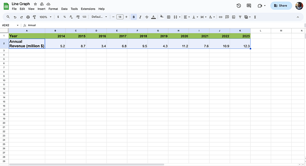
Select the data range for the graph
You must choose the data you need to transform into a graph line before continuing. You can also press “CTRL”+ “A” (“Cmd ⌘” + “A” for Mac) on the keyboard.
3. Create your line graph
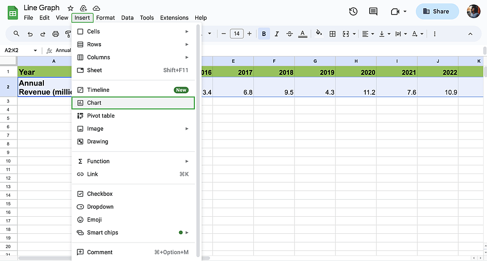
Click Insert then Chart to create your line graph
Click on the Insert tab, and you will see the Chart option. You can simply click on the Chart tab, leading to the Insert Chart Menu.
💡Shortcut: You can directly choose “Insert Chart” from the toolbar.
4. Customize your graph
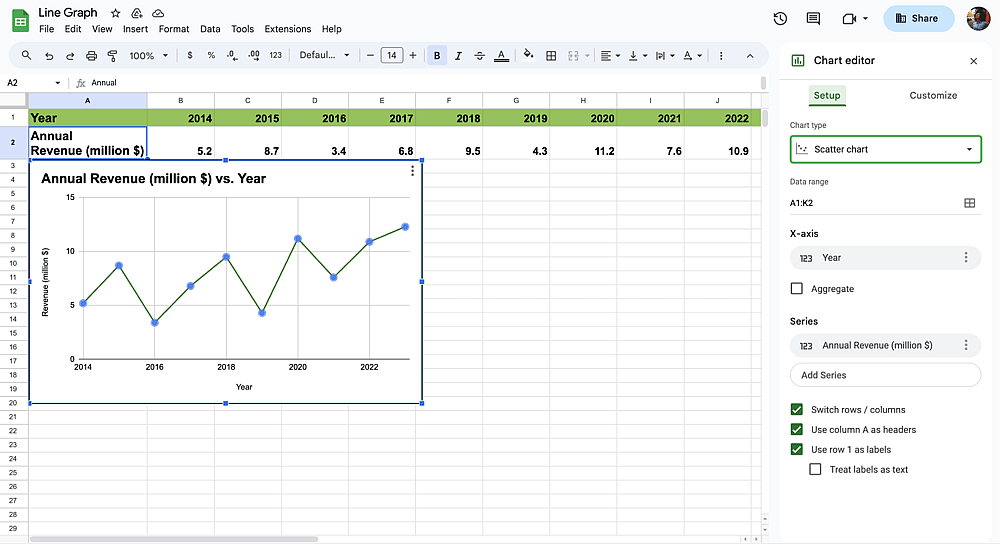
Edit your line graph under the Setup and Customize tabs
Choose Customize from the Chart editor. In this drop-down menu, you can easily change the chart style. From the Chart editor, you can edit the Setup and customize the look of your chart as you wish, from the background color to the font.
5. Share your Google Sheets
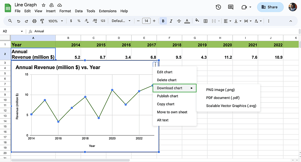
Download options for your chart
Download the chart as PNG, PDF, or Scalable Vector Graphics. Also, you can share the Google Sheet with your target.
Bonus: Using the Sparkline function to create line graphs
By using a Google Sheets formula, you can also simply create a small line chart in a single cell. With the help of the SPARKLINE function, you can sum various data in a single cell. If you want to use the function, here are the steps you need to follow:
1. Click on any blank cell and decide which cells you want to create a column.
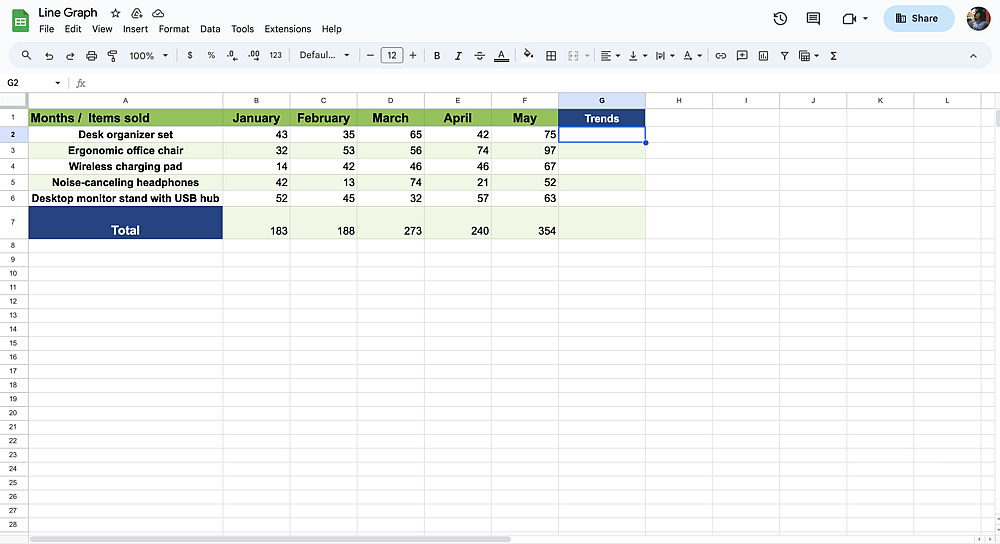
Select any blank cell you want to create a line chart
2. You need to type =SPARKLINE(value1:value2)
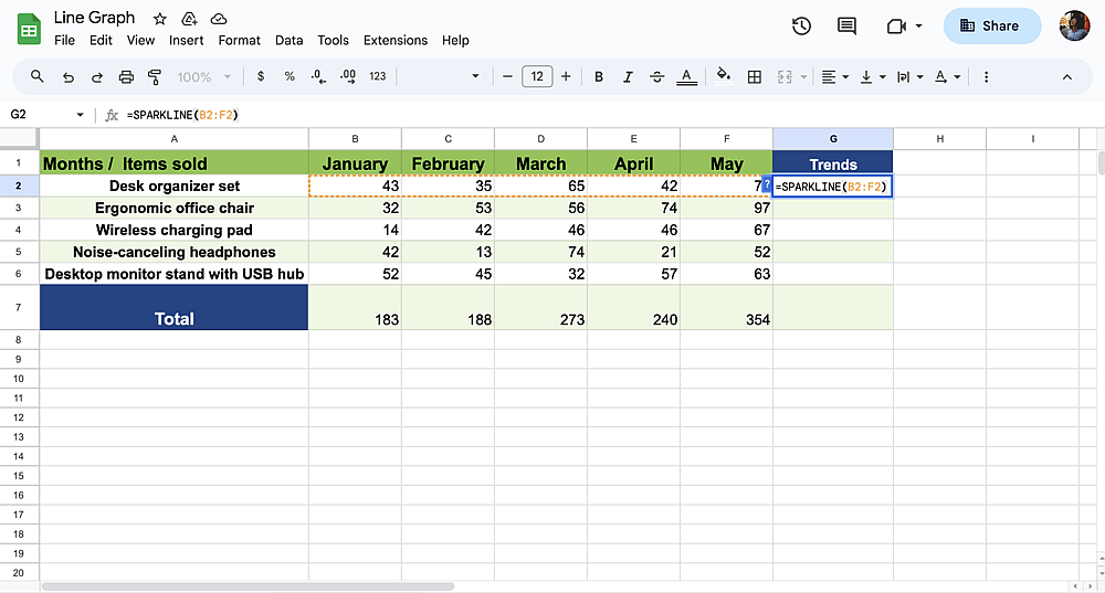
3. To illustrate, if you want to see a chart in a single cell, you type =SPARKLINE(B2:F2). When you press the enter key, you will see a small chart in the cell.

Frequently asked questions about Google Sheets line graphs
If you want to edit your existing line graph on Google Sheets, you can easily do it. You must click on your line graph first, then click on the three dots (⋮). You can choose “Edit chart” and customize your line graph in Google Sheets.
Under the “How to create line graphs in Google Sheets” title, we shared each instruction step by step with you above. To sum up the whole process, you need to follow these steps:
- Choose the data
- Click on Insert first and, secondly, Chart.
- You can edit your chart or change the type of chart based on your needs from the Chart editor.
On Google Sheets, you have lots of options to create graphs and charts. Here are the list of Google Sheets graphs you can use:
- Line chart
- Area chart
- Column chart
- Bar chart
- Pie chart
- Scatter chart
- Map chart
- Other (Waterfall chart, Histogram chart, Radar chart, Gauge chart, Scorecard chart, Candlestick chart, Organizational chart, Treemap chart, Timeline chart, and Table chart)
Yes, you can use Google charts in Google Sheets. There is a close integration between Google Sheets and Google Charts. Google Sheets contains Google charts, so you do not need to download another extension.
You might need multiple lines to illustrate or sum up your data. So, if you want to make multiple lines in your graph line in Google, you need to follow these steps:
- Customize the chart from the Chart editor.
- Click the Data range and type the values you need.
- Click OK, and you will see that your graph comprises multiple lines.
On Google Sheets, you can easily change the color of a line in Google Sheets. All you need to do is choose Customize from the Chart editor. Then, choose the Series from the menu, and you can change the line color easily.
Key points to take away
To wrap it all up, line graphs are a really useful tool to sum up your data. As long as you know how to use them efficiently, line graphs will professionalize your sheets. In our article, we prepared a guideway to share the definition of line graphs, why you need them, and how to make line graphs in Google Sheets with easy steps, faqs, and more!
Contributors
forms.app, your free form builder
- Unlimited views
- Unlimited questions
- Unlimited notifications