One of the popular web hosting services available online is WordPress. But when setting up your website in WordPress, it is essential that you work to avoid common mistakes. Sometimes when we make a website in WordPress, we are so focused on fitting text, images, and colors to the brand guidelines that we fail to see that it can cause mirrors that can affect the functionality of the site.
Often, people make mistakes that are difficult to reverse and cause websites to look distracting. Your WordPress blog needs to appear expert, approachable, mobile-adaptive, trustworthy, compelling, and appealing. In this text; As a solution to these, in this article; Let's look at why you should create forms for your WordPress website, some tips and tricks on what to avoid when designing your website, and how you can create a WordPress form on forms.app.
Why create forms for your WordPress website?
WordPress is a free and open-source platform for creating websites. This platform includes; many web elements, WordPress online forms, WordPress contact form builder, over 60,000 plug-ins, and more… As for why you should create forms for your WordPress website, you can easily and effectively collect and manage information using web forms. So everything will be easier for you. Now, let's look at the justifications for why you ought to design a form for your WordPress website.
1 - You can get the data your need
Web forms are special in that they let you choose the kind of data you get from your customers. By including the mandatory forms and specifying which fields are optional, you guarantee that your website visitors will provide the data you seek. This prevents your database from being clogged up with useless data and enables you to quickly examine the information that has been collected about a customer when you get in touch with them.
2 - You are more likely to retain customers
People are much more likely to return to your website to see whether you're responsive or to look around for any improvements after actually taking the time to fill out your form. This way, you get customers.
3 - It’s practical
The easiest approach for clients to get in touch with you is through a web form because they don't even have to leave your contact page. As a result, this increases the likelihood that your customers will stay on your website longer after contacting you.

7 common mistakes when creating a WordPress form
Every time we pick up a new skill, we make errors. It is unavoidable. Or one can make a mistake with a moment of carelessness. This can happen to any of us, whether you are inexperienced or an expert. You don't have to worry about that. Here you can avoid errors by examining the errors that can compromise a site's security and performance. Or you can be more careful now. Let's take a look at these 7 errors and their solutions.
1 - Avoid unmatching colors
❌Do not use unmatching colors: Using incompatible colors will not give a good impression to the readers. In the customize section of forms.app, you can choose from many different colors to suit your site.
✅Use color palettes: Color psychology is a powerful web design tool. The important part is that you can choose the right colors using the color palettes. On forms.app, you can select different colors for form elements and make your forms blend into your website.
2 - Avoid disproportional sizing
❌Do not use large or disproportional sizes: Using large sizes can cause problems in resolution, especially in images. In addition, the large size of your articles will not leave you enough space.
✅Choose small and ideal sizes: Embedding your form in ideal dimensions will make it look more consistent for your site visually.
3 - Do not ask for too much information
❌Do not ask too many questions: People don't always have a lot of time. So don't ask unnecessary and irrelevant questions. Keep building your form by putting yourself in their shoes.
✅Ask necessary and clear questions: First, ask for the important information you want to receive. Ask clear questions without exaggeration.
4 - Do not create irregular areas
❌Do not leave poor spaces: Create as tidy and necessary areas as users need. By leaving enough space between fields and sections, you can improve the user experience.
✅Leave as much space as necessary for the page layout: Group the information you want under headings. Organize the page flow by giving the necessary spaces.
5 - Send success or confirmation messages to users
❌Do not leave form confirmation blank: Send users a confirmation or informational message for their time.
✅Send feedback: Express your satisfaction with any feedback, such as a thank you message to users. In this way, they will feel valued. On forms.app, you can add a Thank-you page to your forms or send email notifications.
6 - Embed your forms to a relevant website
❌Do not place your forms in irrelevant fields: When you place your forms in relevant areas on your site, it will be much more accessible to users.
✅Put your forms in the right fields: There are certain correct fields for forms on your site. When you place your forms in the right field, users may be more likely to fill out the form.
7 - Do not show irrelevant questions to users
❌Do not waste the time of respondents with irrelevant questions: No one wants to answer irrelevant questions and fill out long forms. Give them what they need.
✅Use conditional logic: Show people only the questions they need to answer. You can do this easily with the conditional logic feature of forms.app. Thus, you will be asking personalized questions.
How to create a WordPress form on forms.app
In addition to creating a simple form in forms.app, it allows you to quickly create a wide variety of forms. We told you about some common mistakes above. After creating these forms, you may be thinking about questions such as how to add them to your WordPress site. You don't have to worry about these. We will show you step by step how to create web forms for WordPress in forms.app and place them on your site.
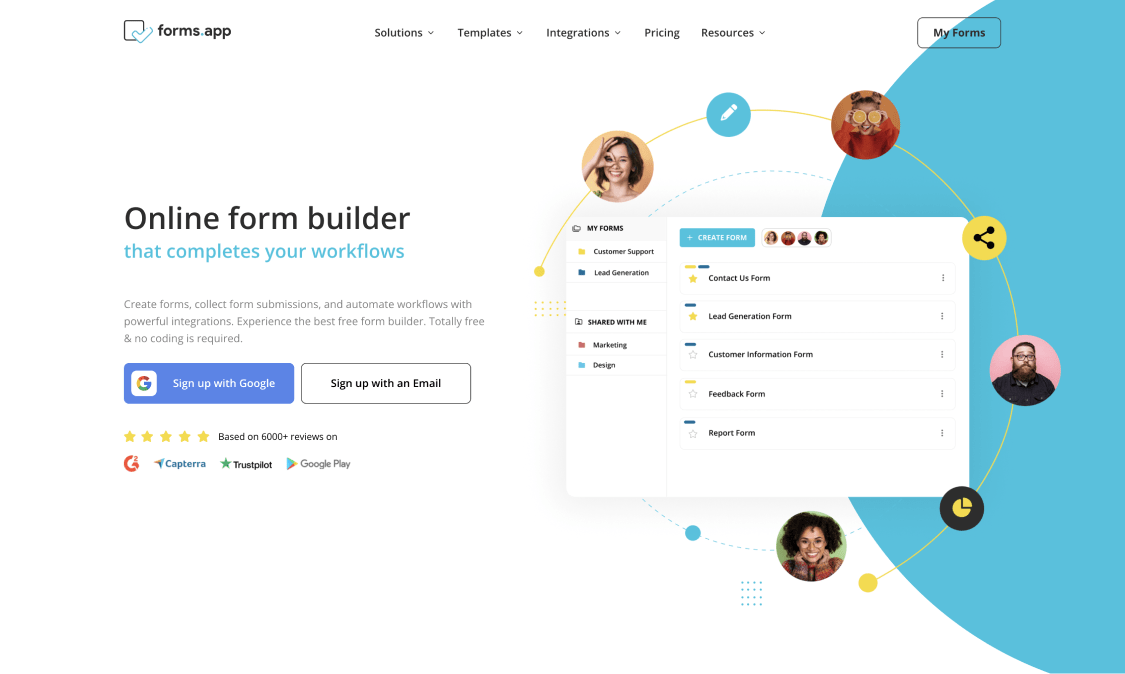
Step 1: The first step is to register or log in to forms.app
Before starting your form, you need to create a free account on forms.app or sign in to your existing account.
* * *
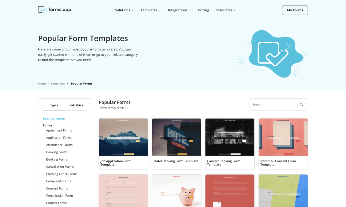
Step 2: Create your form with a form builder, like forms.app
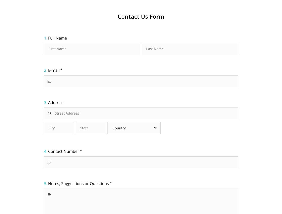
With the form builder, you can create a form from scratch. Or, if you wish, you can choose the template you want from the ready-made form samples. For example, it could be a registration form template or a contact form template.
* * *
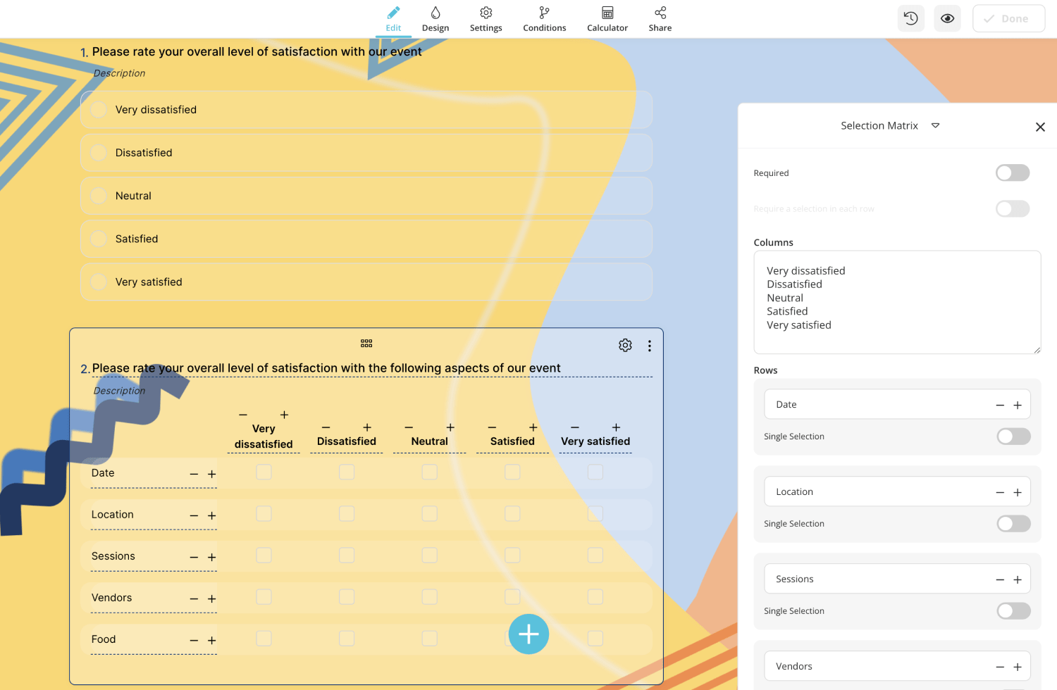
Step 3: Add the fields to your form
Add the questions you want to add or ask to your form. Add the questions you need in the 'Edit' section. For a simple contact form, you can add your name and surname, contact information, and a message field.
* * *
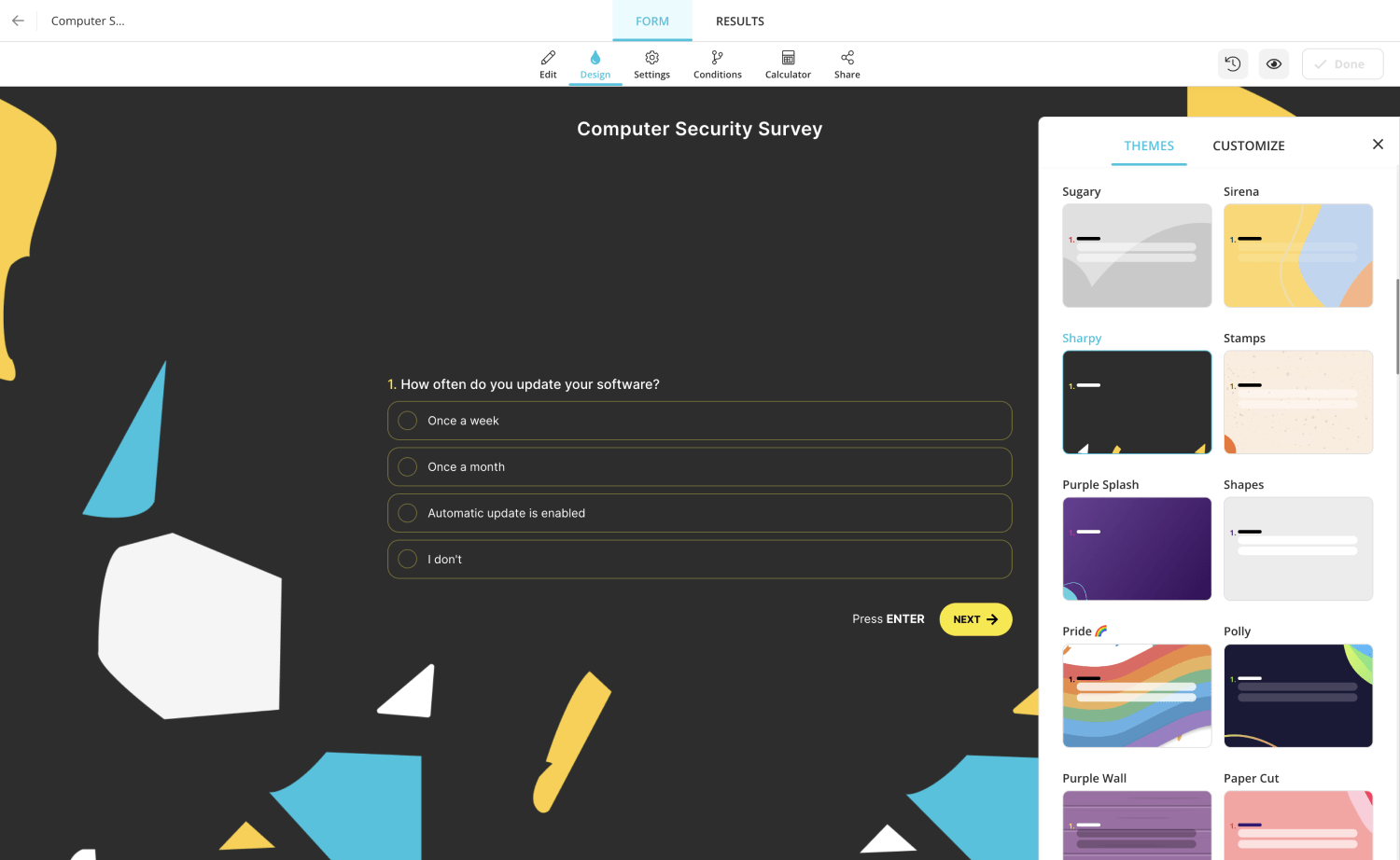
Step 4: Design your form according to your taste
Customize your form's design and colors. Use the you want in the 'Design' section.
* * *
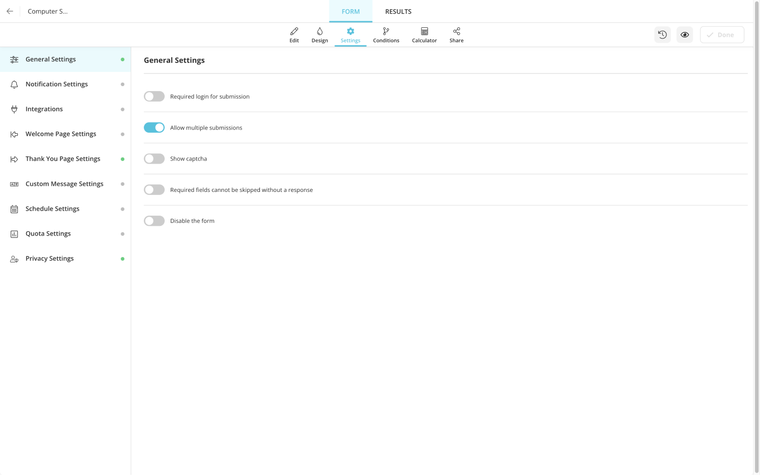
Step 5: Change your form settings
In 'Settings,' you can set notification settings, 'Welcome page' or 'Thanks page' and integration options. Here you can select the integrations if you want.
* * *
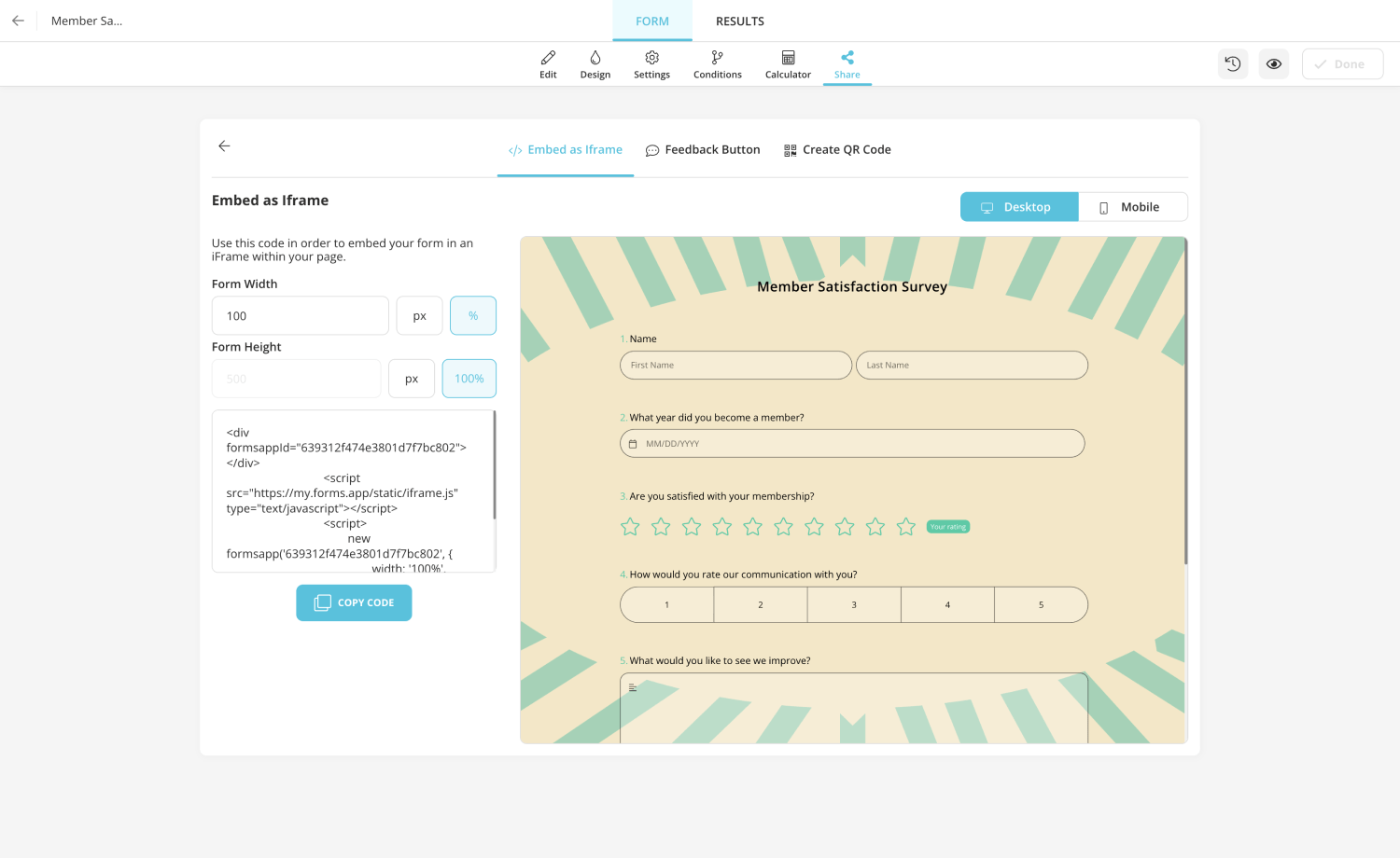
Step 6: Embed your form
You need to embed the form you created, similar to the WordPress form creator, on your website. You can add it in two different ways:
- First, copy the iframe code by setting the width and height values of your form in the 'Sharing' section. Custom HTML is selected in the WordPress dashboard, dragged to the page or template you want, and pasted the HTML code here.
- Alternatively, forms.app offers a plugin for the form manager WordPress. You can install this plugin from the WordPress dashboard in the 'Plugin' section. The WordPress forms plugin will now appear in the WordPress interface. This section will now display all the forms you have created in a user-friendly interface. From here, you can easily add the form you want wherever you want.
Free form templates for your WordPress website
Creating online forms for your WordPress website has never been easier. The Forms.app user interface is so user-friendly and intuitive that you can create the forms you want in just a few minutes. When creating a form for WordPress, you can speed up your work by choosing one of the free ready-made templates available in forms.app. And this will save you a huge amount of time.
Conclusion
Forms are one of the best ways to collect information from people who visit your website. Using a form, you can ask people specific questions and get the information you need. There are several common mistakes people make when creating forms for WordPress websites. However, by following the tips above, you can avoid these mistakes and create a form that is both user-friendly and effective. Creating a form for your WordPress website with forms.app is very easy and does not require any prior knowledge. Now is the time to create forms for your WordPress website!


 7 min read