5 Secrets to create an effective presentation on survey results
Information is power. However, undigested information has the power to derail the goals you’ve set up for your business, creative project, brand, or other venture. Gathering data through surveys and polls is one of the most critical steps to take toward improving your project, but that’s only part of the battle.
If you’ve collected all the info you need and are left wondering, “What now?” don’t worry. Here are the top-secret tips for organizing and presenting your survey responses effectively. And we’re not keeping them hush-hush!
How to create a survey results presentation
You may have an idea of why you should put together a survey results presentation. Still, let’s go through a short reminder. Well-presented data is a catalyst for:
- Engaging and persuading your audience.
- Understanding the data better, connecting the dots, and finding insights.
- Communicating, collaborating, and discussing the facts presented with peers.
- Putting together a new strategy informed by the survey results.
- Making decisions and taking action that can push your goals forward.
All that sounds awesome. But how do you go about it? This is what we’re here for.
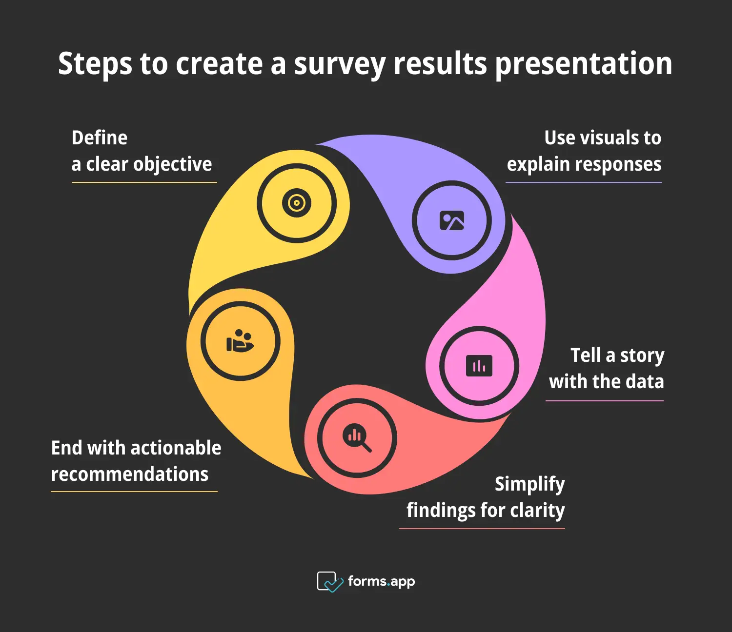
Secrets for creating a survey results presentation
Secret 1: Start with a clear objective
Want to learn our first little secret? Have a clear objective. This really shouldn’t be a secret at all! After all, you created the survey because you needed information on a specific topic. Let’s get back to that. What is it you’re trying to accomplish?
a. Define the purpose of the presentation on survey results
If you don’t know what you’re trying to say during the presentation, it will be hard to get the right message across. Defining the purpose of your presentation means understanding what story you want to tell or what the end goal of this process is.
For example, you may be considering a rebrand, but first, you must feel the pulse of your current identity in order to have a clear path to follow. In this case, you have a specific idea of what you’ll be presenting.
Establish the basics and go from there.
b. Align data with the objective
What happens when you’re bombarded with information? You probably get overwhelmed and shut down. Irrelevant data will only confuse and push your audience away. To be as effective as possible, search for and select the data in your survey results that support your key message.
For example, while surveying people for your rebrand project, you may find that women are more likely to answer the poll than men. While that’s an interesting piece of information, it probably won’t be on-topic, so it may be best to leave it out.
c. Create a title or summary slide
Now that you got the foundation down, it’s time to get your hands dirty and create your presentation on survey results. In more practical terms, frame the survey’s purpose during the first couple of slides. They will help you determine the objective and get everybody on the same page from the get-go.
Secret 2: Use visuals strategically to explain survey responses
Pay attention to the following presentation and decide which format engages you more easily:
A few years ago, Forbes published an article about the shift in storytelling and media consumption. They shared that 91% of people opted for visual and interactive media rather than traditional, text-based content.
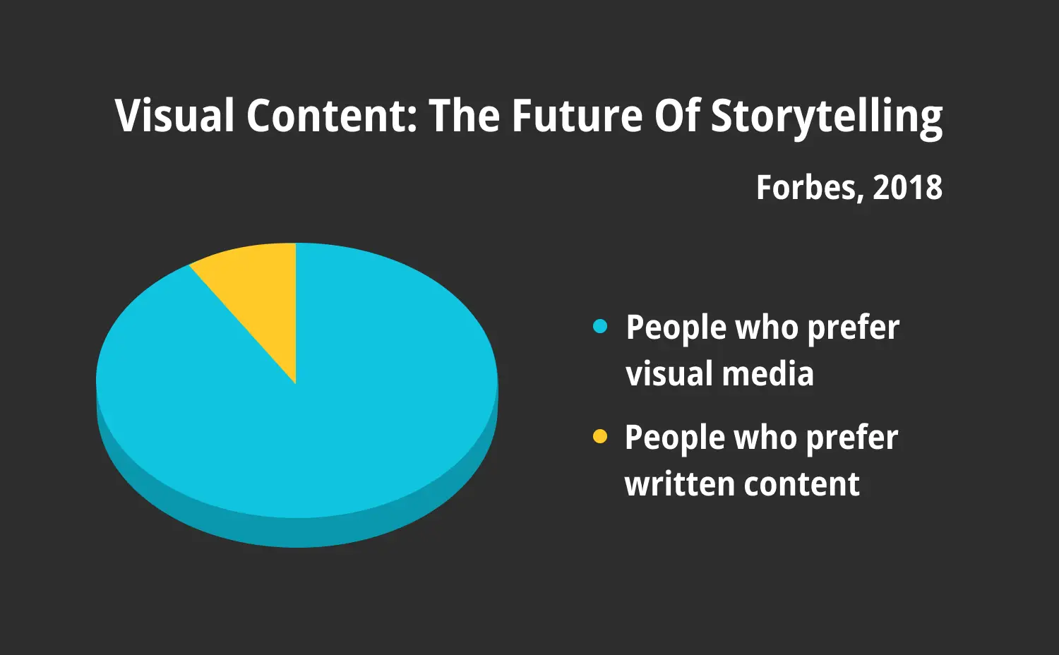
Statistics conducted by Forbes (2018)
You probably looked at and processed the image before reading the text, right? This goes to show the pull that visuals have when presenting data. And this is why you should harness that power in your survey results presentation!
a. Illustrate complex data with visuals
You’ve probably seen an infographic depicting the steps in a water cycle (condensation, precipitation, collection, and evaporation). The water cycle is full of technical terms and complex information. However, an image of a cloud, rain, a lake, and steam make it infinitely simpler.

An example illustration
This is another example of how using well-designed infographics, graphics, and charts can make the data you gathered much more memorable and accessible.
b. Choose the right visual type
Not all information is created equal. Therefore, not all information will benefit from the same type of visual aid. Here’s a short cheat sheet that can guide you when deciding which one fits the information presented better:
- Bar charts work best for comparisons.
- Pie charts can help clarify proportions or percentages.
- Line graphs are used for trends.
- Infographics combine multiple pieces of information into a cohesive narrative.
You may also decide that the information you want to put forth isn’t suitable for visuals, which brings us to our next tip.
c. Avoid visual clutter
Overstimulating your audience is not your friend. Far from it! While visual aids can make your presentation more engaging and digestible, too many can have the opposite effect.
As a main tip, focus on one main visual per slide or segment to retain the audience’s focus on the key points.
Secret 3: Tell a story with the data from the survey responses
Once upon a time, there were survey results that needed to be engaging and understood. They discovered that telling a story was an effective way to convey their message, and they lived happily ever after.
People love stories. While abstract numbers and statistics hold weight, they don’t hold a candle to what a good story can do:
- Establish an emotional connection
- Make data relatable and memorable
- Provide context
- Influence decisions
- Encourage actions
Crafting a story with your survey results makes a lot of sense; you just have to:
a. Structure the presentation on survey results as a story
So, you’re on board with a storytelling presentation, but how do you build it?
Travel back to all the stories you’ve heard, read, and seen. It’s likely they all had a definite structure made up of a beginning, middle, and end.
Logically, you must follow a similar structure to create a story with your data. Let’s dig a bit deeper into each section, shall we?
b. Beginning: Provide context and purpose
Your beginning will be the introduction of it all. The very first thing should be to provide the context and purpose of the survey and presentation. Think about:
- Setting the stage by letting your audience know why the survey was conducted, the questions you asked, and the importance of the results.
- Framing the narrative by introducing the main themes and concerns you were addressing.
c. Middle: Highlight surprising or impactful insights
The middle of your story is where you’ll present all the juicy twists and turns that will carry the narrative on and captivate your audience. To do it properly:
- Show the journey and present the findings in a logical order that will help the story flow effortlessly.
- Emphasize unexpected results that could sway decisions, uncover new areas of opportunity, and grab your audience’s attention.
While going through the middle or meatier part of your story, use the visual aids to share the more data-heavy findings.
d. End: Narrate how the findings will impact your project
Finally, bring your story to a pleasing conclusion. Narrate how the findings will affect your project or decision-making process. For a happily ever after, you must:
- Summarize the findings and relate them back to the survey’s objective.
- Suggest next steps, further discussion, or actionable advice.
Once again, focus on bringing all the key players and situations in your story to a closing in a way that your audience can better understand what your future goals are.
Secret 4: Simplify the findings for clarity
What good is it to have great insights if you can’t get your team to agree on what they are? Confusion can have disastrous consequences:
- Forgettable presentations: people are likely to forget all about your presentation if they don’t understand what it’s about.
- Boredom and disconnection: you won’t have your audience’s attention, and your data won’t be compelling.
- Stagnation: given that your presentation was unmemorable and draining, it won’t lead to any productive discussions or next steps.
Needless to say, clarity should be a priority in your presentation on survey results. Avoid confusion like the plague and create a clear presentation with the following tips.
a. Limit text and avoid jargon
Probably the most essential tip here is to keep things short and sweet. Be as concise as possible; say all you have to say without going in circles. Stay on track by:
- Using bullet points in your slides to share straightforward sentences and ideas.
- Moving away from jargon, overly technical terms, or showy vocabulary.
This also includes limiting the amount of text in your slides. Remember that a text-filled slide is pointless: your audience won’t read it, and it can make the presentation seem overwhelming.
b. Use formatting to emphasize key information
There’s certain information that you want your audience to really focus on, and the right design can help you out. Aside from using charts and infographics, you can use text formatting to demand attention. For instance, you can use:
- Larger fonts
- Bolded, italicized, underlined, or highlighted text
- Contrasting colors
- A minimalist design
Design the aesthetics of your presentation to drive your goals. This includes knowing that if you try to make everything stand out, nothing will. To accentuate information, you need to be very selective about what pieces will take center stage.
c. Break down your findings
Instead of sharing all the information you collected as is, break down the main findings so they’re very easy to understand. To organize your findings into digestible sections, separate them in terms of:
- Themes
- Chronological order
- Impact
The idea here is to guide the audience through the maze of information.
And while we’re on that subject, keep in mind that smaller data chunks are more manageable to assimilate, so get them in your presentation on survey results.
d. One idea at a time
Like we’ve mentioned before, use your slides wisely. If you’re overloading, stuffing, jumping around, overexplaining, and emptying out everything on your presentation slides, you’re going in the wrong direction. To steer right:
- Make slides straightforward by sharing and supporting one main idea with the data or visual aid it needs.
- Create a cohesive narrative with a logical flow to maintain your audience’s attention.
Secret 5: End with actionable recommendations
Everybody remembers a good ending (for instance, the one from the movie Sixth Sense). While you may not be aiming to produce the most mind-altering twist in cinematic history, strive to create a lasting impression that will inspire your audience to act. Ending with a bang:
- Cements your main points
- Motivates and influences
- Provides closure
Here’s how to end strong.
a. Use survey response insights to guide future steps
Once more, we must return to your survey’s purpose. In many cases, you may need data to improve your project or make strategic decisions. And one of the best moves to help that process is to tie your insights to future steps. Ask yourself:
- How do the results align with your goals?
- How is this information relevant to creating opportunities?
- What specific, concrete, measurable steps can you take to move towards your goals?
- What impact and benefits can come from following the recommendations?
- How can the audience use these findings to improve or make strategic decisions?
If you’ve answered these questions, share your responses with your team so you can get to work!
Tip: Make your life easier with a free online form builder like forms.app. It’s a great companion that will help you collect the survey responses you need to push your projects forward!
b. Have a Q&A slide
Further discussions, questions, and comments indicate you may have had a successful presentation. Questions and collaboration mean people were interested in what you had to say. If not, they just wouldn’t engage.
This is why we strongly suggest you include a Q&A slide in your presentation. Not only does it help build creativity and explore ideas, but it also helps clarify any lingering doubts. All in all, a Q&A session can help bring everybody on board together.
Just be sure to truly understand your material and try to anticipate certain questions so you’re not caught off guard.
c. Recap
Last but definitely not least, spend a couple of minutes recapping the presentation. A short reminder of the purpose, findings, and recommendations will ensure that your audience will leave with that message. If you have events planned (like brainstorming sessions or discussion groups) related to your presentation, this would be the time to inform your audience about them.
And don’t forget to thank people for their attention, suggestions, and willingness to participate!
Now you know how to create a killer survey results presentation!
Survey responses on their own are great but will only get you so far. Presenting them effectively will help explore and exploit them to their full potential. Creating a survey results presentation doesn’t have to be complicated, but you should be aware of the key secrets to success.
Just as long as you know the purpose of it all and have a few aces up your sleeve (visual aids, well-designed slides, storytelling, clarity, Q&A sessions, etc.), you should be on your way to a killer survey results presentation.
Defne is a content writer at forms.app. She is also a translator specializing in literary translation. Defne loves reading, writing, and translating professionally and as a hobby. Her expertise lies in survey research, research methodologies, content writing, and translation.
- How to create a survey results presentation
- Secret 1: Start with a clear objective
- Secret 2: Use visuals strategically to explain survey responses
- Secret 3: Tell a story with the data from the survey responses
- Secret 4: Simplify the findings for clarity
- Secret 5: End with actionable recommendations
- Now you know how to create a killer survey results presentation!